Assessing the effects of missing data
Robert W Schlegel
2019-03-19
Last updated: 2019-03-19
workflowr checks: (Click a bullet for more information)-
✔ R Markdown file: up-to-date
Great! Since the R Markdown file has been committed to the Git repository, you know the exact version of the code that produced these results.
-
✔ Environment: empty
Great job! The global environment was empty. Objects defined in the global environment can affect the analysis in your R Markdown file in unknown ways. For reproduciblity it’s best to always run the code in an empty environment.
-
✔ Seed:
set.seed(666)The command
set.seed(666)was run prior to running the code in the R Markdown file. Setting a seed ensures that any results that rely on randomness, e.g. subsampling or permutations, are reproducible. -
✔ Session information: recorded
Great job! Recording the operating system, R version, and package versions is critical for reproducibility.
-
Great! You are using Git for version control. Tracking code development and connecting the code version to the results is critical for reproducibility. The version displayed above was the version of the Git repository at the time these results were generated.✔ Repository version: 970b22c
Note that you need to be careful to ensure that all relevant files for the analysis have been committed to Git prior to generating the results (you can usewflow_publishorwflow_git_commit). workflowr only checks the R Markdown file, but you know if there are other scripts or data files that it depends on. Below is the status of the Git repository when the results were generated:
Note that any generated files, e.g. HTML, png, CSS, etc., are not included in this status report because it is ok for generated content to have uncommitted changes.Ignored files: Ignored: .Rhistory Ignored: .Rproj.user/ Ignored: data/sst_ALL_clim_only.Rdata Ignored: data/sst_ALL_event_aov_tukey.Rdata Ignored: data/sst_ALL_flat.Rdata Ignored: data/sst_ALL_miss.Rdata Ignored: data/sst_ALL_miss_cat_chi.Rdata Ignored: data/sst_ALL_miss_clim_event_cat.Rdata Ignored: data/sst_ALL_miss_clim_only.Rdata Ignored: data/sst_ALL_miss_event_aov_tukey.Rdata Ignored: data/sst_ALL_repl.Rdata Ignored: data/sst_ALL_smooth.Rdata Ignored: data/sst_ALL_smooth_aov_tukey.Rdata Ignored: data/sst_ALL_smooth_event.Rdata Ignored: data/sst_ALL_trend.Rdata Ignored: data/sst_ALL_trend_clim_event_cat.Rdata Untracked files: Untracked: analysis/bibliography.bib Untracked: code/functions.R Untracked: code/workflow.R Untracked: data/.gitignore Untracked: data/clim_py.csv Untracked: data/clim_py_joinAG_1.csv Untracked: data/clim_py_joinAG_5.csv Untracked: data/clim_py_joinAG_no.csv Untracked: data/clim_py_minD_3.csv Untracked: data/clim_py_minD_7.csv Untracked: data/clim_py_pctile_80.csv Untracked: data/clim_py_pctile_95.csv Untracked: data/clim_py_pctile_99.csv Untracked: data/clim_py_random.csv Untracked: data/clim_py_spw_11.csv Untracked: data/clim_py_spw_51.csv Untracked: data/clim_py_spw_no.csv Untracked: data/clim_py_whw_3.csv Untracked: data/clim_py_whw_7.csv Untracked: data/mhwBlock.csv Untracked: data/mhws_py.csv Untracked: data/mhws_py_joinAG_1.csv Untracked: data/mhws_py_joinAG_5.csv Untracked: data/mhws_py_joinAG_no.csv Untracked: data/mhws_py_minD_3.csv Untracked: data/mhws_py_minD_7.csv Untracked: data/mhws_py_pctile_80.csv Untracked: data/mhws_py_pctile_95.csv Untracked: data/mhws_py_pctile_99.csv Untracked: data/mhws_py_random.csv Untracked: data/mhws_py_spw_11.csv Untracked: data/mhws_py_spw_51.csv Untracked: data/mhws_py_spw_no.csv Untracked: data/mhws_py_whw_3.csv Untracked: data/mhws_py_whw_7.csv Untracked: data/sst_ALL.Rdata Untracked: data/sst_ALL_KS.Rdata Untracked: data/sst_ALL_cat_chi.Rdata Untracked: data/sst_ALL_clim_category_count.Rdata Untracked: data/sst_ALL_con.Rdata Untracked: data/sst_ALL_detrend.Rdata Untracked: data/sst_ALL_event_cor.Rdata Untracked: data/sst_ALL_miss_clim_KS_p.Rdata Untracked: data/sst_ALL_miss_clim_aov_p.Rdata Untracked: data/sst_ALL_miss_clim_aov_tukey.Rdata Untracked: data/sst_ALL_miss_event_CI.Rdata Untracked: data/sst_ALL_smooth_R2.Rdata Untracked: data/sst_ALL_smooth_R2_base.Rdata Untracked: data/sst_ALL_smooth_cor_base.Rdata Untracked: data/sst_ALL_smooth_real_category.Rdata Untracked: data/sst_ALL_trend_cat_chi.Rdata Untracked: data/sst_ALL_trend_clim_KS_p.Rdata Untracked: data/sst_ALL_trend_clim_aov_tukey.Rdata Untracked: data/sst_ALL_trend_clim_only.Rdata Untracked: data/sst_ALL_trend_event_CI.Rdata Untracked: data/sst_ALL_trend_event_aov_tukey.Rdata Untracked: data/sst_WA.csv Untracked: data/sst_WA_miss_ice.csv Untracked: data/sst_WA_miss_random.csv Unstaged changes: Deleted: .Rbuildignore Modified: .gitignore Deleted: DESCRIPTION Deleted: NAMESPACE Modified: NEWS.md Deleted: R/MHWdetection-package.R Deleted: R/placeholder.R Modified: README.md Deleted: _pkgdown.yml Modified: _workflowr.yml Modified: analysis/_site.yml Deleted: docs/articles/fig/heatwaveR_v3.svg Deleted: docs/docsearch.css Deleted: docs/docsearch.js Deleted: docs/link.svg Deleted: docs/pkgdown.css Deleted: docs/pkgdown.js Deleted: docs/pkgdown.yml Deleted: docs/sitemap.xml Deleted: man/MHWdetection-package.Rd Deleted: man/placeholder.Rd Deleted: tests/testthat.R Deleted: tests/testthat/test-placeholder.R Deleted: vignettes/.gitignore Deleted: vignettes/Climatologies_and_baselines.Rmd Deleted: vignettes/Short_climatologies.Rmd Deleted: vignettes/best_practices.Rmd Deleted: vignettes/bibliography.bib Deleted: vignettes/data/.gitignore Deleted: vignettes/data/clim_py.csv Deleted: vignettes/data/clim_py_joinAG_1.csv Deleted: vignettes/data/clim_py_joinAG_5.csv Deleted: vignettes/data/clim_py_joinAG_no.csv Deleted: vignettes/data/clim_py_minD_3.csv Deleted: vignettes/data/clim_py_minD_7.csv Deleted: vignettes/data/clim_py_pctile_80.csv Deleted: vignettes/data/clim_py_pctile_95.csv Deleted: vignettes/data/clim_py_pctile_99.csv Deleted: vignettes/data/clim_py_random.csv Deleted: vignettes/data/clim_py_spw_11.csv Deleted: vignettes/data/clim_py_spw_51.csv Deleted: vignettes/data/clim_py_spw_no.csv Deleted: vignettes/data/clim_py_whw_3.csv Deleted: vignettes/data/clim_py_whw_7.csv Deleted: vignettes/data/mhwBlock.csv Deleted: vignettes/data/mhws_py.csv Deleted: vignettes/data/mhws_py_joinAG_1.csv Deleted: vignettes/data/mhws_py_joinAG_5.csv Deleted: vignettes/data/mhws_py_joinAG_no.csv Deleted: vignettes/data/mhws_py_minD_3.csv Deleted: vignettes/data/mhws_py_minD_7.csv Deleted: vignettes/data/mhws_py_pctile_80.csv Deleted: vignettes/data/mhws_py_pctile_95.csv Deleted: vignettes/data/mhws_py_pctile_99.csv Deleted: vignettes/data/mhws_py_random.csv Deleted: vignettes/data/mhws_py_spw_11.csv Deleted: vignettes/data/mhws_py_spw_51.csv Deleted: vignettes/data/mhws_py_spw_no.csv Deleted: vignettes/data/mhws_py_whw_3.csv Deleted: vignettes/data/mhws_py_whw_7.csv Deleted: vignettes/data/sst_ALL.Rdata Deleted: vignettes/data/sst_ALL_KS.Rdata Deleted: vignettes/data/sst_ALL_cat_chi.Rdata Deleted: vignettes/data/sst_ALL_clim_category_count.Rdata Deleted: vignettes/data/sst_ALL_con.Rdata Deleted: vignettes/data/sst_ALL_detrend.Rdata Deleted: vignettes/data/sst_ALL_event_cor.Rdata Deleted: vignettes/data/sst_ALL_miss_clim_KS_p.Rdata Deleted: vignettes/data/sst_ALL_miss_clim_aov_p.Rdata Deleted: vignettes/data/sst_ALL_miss_clim_aov_tukey.Rdata Deleted: vignettes/data/sst_ALL_miss_event_CI.Rdata Deleted: vignettes/data/sst_ALL_miss_event_aov_tukey.Rdata Deleted: vignettes/data/sst_ALL_smooth_R2.Rdata Deleted: vignettes/data/sst_ALL_smooth_R2_base.Rdata Deleted: vignettes/data/sst_ALL_smooth_cor_base.Rdata Deleted: vignettes/data/sst_ALL_smooth_real_category.Rdata Deleted: vignettes/data/sst_ALL_trend_cat_chi.Rdata Deleted: vignettes/data/sst_ALL_trend_clim_KS_p.Rdata Deleted: vignettes/data/sst_ALL_trend_clim_aov_tukey.Rdata Deleted: vignettes/data/sst_ALL_trend_clim_only.Rdata Deleted: vignettes/data/sst_ALL_trend_event_CI.Rdata Deleted: vignettes/data/sst_ALL_trend_event_aov_tukey.Rdata Deleted: vignettes/data/sst_WA.csv Deleted: vignettes/data/sst_WA_miss_ice.csv Deleted: vignettes/data/sst_WA_miss_random.csv Deleted: vignettes/fig/detect_diagram.svg Deleted: vignettes/fig/heatwaveR_v3.svg Deleted: vignettes/gridded_products.Rmd Deleted: vignettes/missing_data.Rmd Deleted: vignettes/r_vs_python.Rmd Deleted: vignettes/r_vs_python_additional.Rmd Deleted: vignettes/r_vs_python_arguments.Rmd Deleted: vignettes/time_series_duration.Rmd Deleted: vignettes/trend.Rmd Deleted: vignettes/variance.Rmd
Expand here to see past versions:
Overview
The purpose of this vignette is to quantify the effects that missing data have on the detection of events. Specifically, the relationship between the percentage of missing data, as well as the consecutive number of missing days, on how much the seasonal climatology, the 90th percentile threshold, and the MHW metrics may differ from those detected against the same time series with the same amount of missing data as well as no missing data.
The missing data will be ‘created’ by striking out existing data from the three pre-packaged time series in the heatwaveR package, which themselves have no missing data. These data will first be detrended so that the random missing data removed will not be conflated with any trend in the data. The data will be removed in two primary ways:
- the first method will be to simply use a random selection algorithm to indiscriminately remove an increasing proportion of the data;
- the second method will be to systematically remove data from specific days/times of the year to simulate missing data that users may encounter in a real-world scenario
- one method will be to remove only weekend days from the data
- another method is to remove only winter data to simulate ice-cover
- the last is to have only one day of data per week
It is hypothesised that the more consecutive missing days of data there are, the more pronounced the effect will be on the results. It is also hypothesised that consecutive missing days will have a more pronounced effect/be a better indicator of time series strength than the simple proportion of missing data. A third hypothesis is that there will be a relatively clear threshold for the proportion of consecutive missing days that will prevent accurate MHW detection.
library(tidyverse)
library(broom)
library(heatwaveR, lib.loc = "~/R-packages/")
# cat(paste0("heatwaveR version = ",packageDescription("heatwaveR")$Version))
library(lubridate) # This is intentionally activated after data.table
library(fasttime)
library(ggpubr)
library(boot)
library(FNN)
library(mgcv)
# library(padr)
library(ggridges)
Random missing data
First up we begin with the random removal of increasing proportions of the data. We are going to use the full 37 year time series for these missing data experiments. We will randomly remove, 0 – 50% of the data from each of the three times series in 1% steps. This is being repeated 100 times to allow for more reproducible results. It is assumed that the results will begin to break down well before the 50% mark. Should they not then we will extend the missing proportion.
# First load the de-trended data created in the duration vignette
load("data/sst_ALL_flat.Rdata")

# Function for knocking out data but maintaing the time series consistency
random_knockout <- function(prop){
  # NB: Don't allow samppling of first and last value to ensure
  # all time series are the same length
  ts_length <- nrow(filter(sst_ALL_flat, site == "WA"))
  miss_index <- sample(seq(2, ts_length-1, 1), ts_length*prop, replace = F)
  # df$x1[sample(nrow(df),250)] <- NA
  res <- sst_ALL_flat %>%
    group_by(site, rep) %>%
    mutate(row_index = 1:n(),
           temp = replace(temp, which(row_index %in% miss_index), NA)) %>%
    mutate(miss = as.character(prop)) %>%
    select(-row_index)
  return(res)
}

# Randomly knockout 0 - 50% of each of the 100 re-samples
doMC::registerDoMC(cores = 26)
sst_ALL_miss <- plyr::ldply(seq(0.00, 0.50, 0.01), random_knockout, .parallel = T)
save(sst_ALL_miss, file = "data/sst_ALL_miss.Rdata")
Consecutive missing days
# This file is not uploaded to GitHub as it is too large
# One must first run the above code locally to generate and save the file
load("data/sst_ALL_miss.Rdata")

# Quantify consecutive missing days
con_miss <- function(df){
  ex1 <- rle(is.na(df$temp))
  ind1 <- rep(seq_along(ex1$lengths), ex1$lengths)
  s1 <- split(1:nrow(df), ind1)
  res <- do.call(rbind,
                 lapply(s1[ex1$values == TRUE], function(x)
                   data.frame(index_start = min(x), index_end = max(x))
                   )) %>%
    mutate(duration = index_end - index_start + 1) %>%
    group_by(duration) %>%
    summarise(count = n())
  return(res)
}

# Calculate the consecutive missing days
doMC::registerDoMC(cores = 50)
sst_ALL_con <- plyr::ddply(filter(sst_ALL_miss, miss != 0),
                           c("site", "miss", "rep"), con_miss, .parallel = T)
save(sst_ALL_con, file = "data/sst_ALL_con.Rdata")
# Load consecutive miss count data
load("data/sst_ALL_con.Rdata")
# Prep the con results for plotting
sst_ALL_con_plot <- sst_ALL_con %>%
select(-rep) %>%
group_by(miss, duration) %>%
summarise(count = round(mean(count))) %>%
ungroup()
# sst_ALL_con_plot_sub <- sst_ALL_con_plot %>%
# filter(prop %in% c(1, 10, 20, 30, 40, 50))
# Bar plot
# ggplot(sst_ALL_con_plot_sub, aes(x = duration, y = count, fill = as.factor(prop))) +
# geom_bar(stat = "identity", position = "dodge") +
# facet_grid(~site) +
# scale_fill_viridis_d() +
# scale_x_continuous(breaks = seq(1, 18, 1)) +
# labs(x = "Consecutive missing days", y = "Count (average)")
# Line plot
ggplot(sst_ALL_con_plot, aes(x = as.numeric(miss), y = duration, colour = count)) +
geom_line(aes(group = miss)) +
geom_point(aes(group = miss)) +
scale_colour_viridis_c(trans = "log10", breaks = c(1, 10, 100, 1000, 2000)) +
scale_y_continuous(breaks = seq(1, 19, 2)) +
# scale_x_continuous(limits = c(1, 50)) +
labs(y = "Consecutive missing days", x = "Missing data (%)")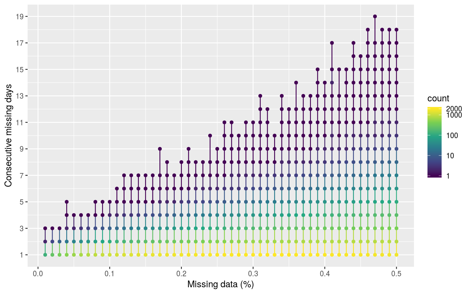
Dot and line plot showing the average count of consecutive missing days of data as the percentage of missing data increases. The colour scale is log transformed.
Expand here to see past versions of con-miss-1.png:
| Version | Author | Date |
|---|---|---|
| fa7fd57 | robwschlegel | 2019-03-19 |
# Ridgeline plot
# ggplot(sst_ALL_con_plot_sub, aes(x = duration, y = as.factor(prop), fill = ..x..)) +
#   # geom_density_ridges() +
#   # geom_ridgeline(aes(height = count/1000)) +
#   geom_density_ridges_gradient(scale = 3, rel_min_height = 0.01) +
#   # geom_density_ridges_gradient(aes(fill = count)) +
#   # theme_ridges() +
#   scale_y_discrete(expand = c(0.01, 0)) +
#   scale_x_continuous(expand = c(0, 0), limits = c(1, 20)) +
#   labs(x = "Consecutive missing days", y = "Missing data (%)")


# ggplot(lincoln_weather, aes(x = `Mean Temperature [F]`, y = `Month`, fill = ..x..)) +
#   geom_density_ridges_gradient(scale = 3, rel_min_height = 0.01) +
#   scale_fill_viridis(name = "Temp. [F]", option = "C") +
#   labs(title = 'Temperatures in Lincoln NE in 2016')

rm(sst_ALL_con_plot)
We see in the figure above that the number of consective missing days increases as the overall proportion of missing days increases. The default in the MHW algorithm is meant to be that one does not by default interpolate over any missing data, but it does accomodate a gap of 2 days or fewer, so one can hypothesise that consecutive missing days of 2 or fewer likely pose little risk to detecting significantly different events. We see that at missing proportions of 9% or lower we exceed this threshold very seldom, while also never having more than 4 consecutive missing days. Linear interpolation is the default method proposed for dealing with missing data, but we will address that in a following section.
Climatology statistics
# This file is not uploaded to GitHub as it is too large
# One must first run the above code locally to generate and save the file
load("data/sst_ALL_miss.Rdata")

# Calculate climatologies, events, and categories on shrinking time series
clim_event_cat_calc <- function(df){
  res <- df %>%
    nest() %>%
    mutate(clims = map(data, ts2clm,
                       climatologyPeriod = c("1982-01-01", "2011-12-31")),
           events = map(clims, detect_event),
           cats = map(events, category)) %>%
    select(-data, -clims)
  return(res)
}

# Calculate all of the MHW related results
doMC::registerDoMC(cores = 50)
sst_ALL_miss_clim_event_cat <- plyr::ddply(sst_ALL_miss, c("miss", "rep", "site"),
                                           clim_event_cat_calc, .parallel = T)
save(sst_ALL_miss_clim_event_cat, file = "data/sst_ALL_miss_clim_event_cat.Rdata")
# This file is not uploaded to GitHub as it is too large
# One must first run the above code locally to generate and save the file
load("data/sst_ALL_miss_clim_event_cat.Rdata")
# Wrapper function to speed up the extraction of clims
miss_clim_only <- function(df){
res <- df %>%
select(-cats) %>%
unnest(events) %>%
filter(row_number() %% 2 == 1) %>%
unnest(events) %>%
select(miss:doy, seas:thresh) %>%
unique() %>%
arrange(doy)
}
# Pull out only seas and thresh for ease of plotting
doMC::registerDoMC(cores = 50)
sst_ALL_miss_clim_only <- plyr::ddply(sst_ALL_miss_clim_event_cat, c("miss", "rep", "site"),
miss_clim_only, .parallel = T)
save(sst_ALL_miss_clim_only, file = "data/sst_ALL_miss_clim_only.Rdata")# This file is not uploaded to GitHub as it is too large
# One must first run the above code locally to generate and save the file
load("data/sst_ALL_miss_clim_only.Rdata")
# visualise
ggplot(arrange(filter(sst_ALL_miss_clim_only, rep %in% as.character(1:10)), -as.numeric(miss)),
aes(y = seas, x = doy, colour = as.numeric(miss)*100)) +
geom_line(alpha = 0.3, aes(group = interaction(rep, miss))) +
scale_colour_viridis_c() +
facet_wrap(~site, ncol = 1, scales = "free_y") +
labs(x = "Calendar day of year", y = "Temp. (°C)", colour = "Missing (%)")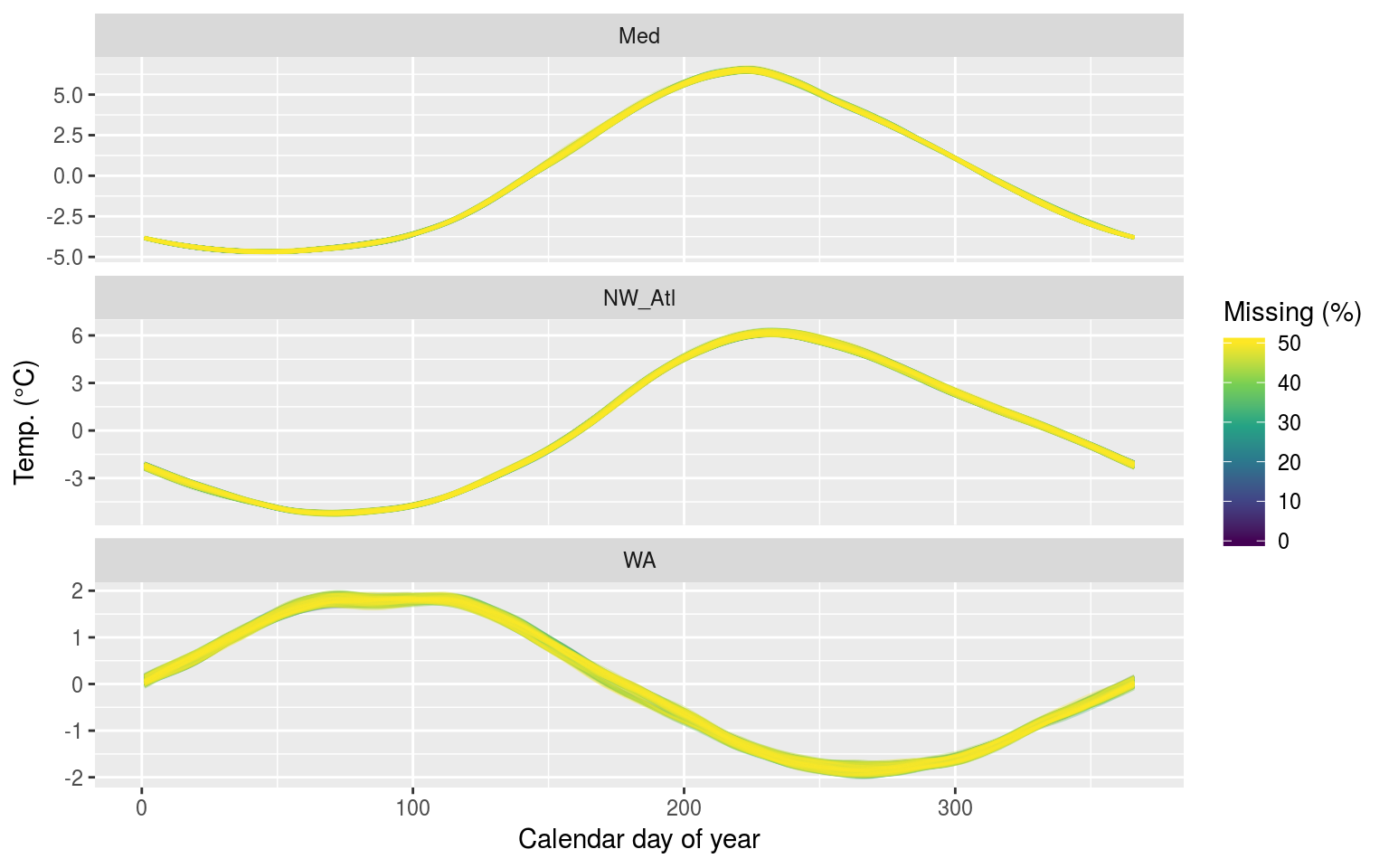
The seasonal signals created from time series with increasing percentages of missing data.
Expand here to see past versions of clim-miss-seas-1.png:
| Version | Author | Date |
|---|---|---|
| fa7fd57 | robwschlegel | 2019-03-19 |
As we may see in the figure above, there is no perceptible difference in the seasonal signal created from time series with varying amounts of missing data for the Mediterranean (Med) and North West Atlantic (NW_Atl) times series. The signal does appear to vary both above and below the real signal after approaching the ~40% missing data mark for the Western Australia (WA) time series.
ggplot(filter(sst_ALL_miss_clim_only, rep %in% as.character(1:10)),
       aes(y = thresh, x = doy, colour = as.numeric(miss)*100)) +
  geom_line(alpha = 0.3, aes(group = interaction(rep, miss))) +
  scale_colour_viridis_c() +
  facet_wrap(~site, ncol = 1, scales = "free_y") +
  labs(x = "Calendar day of year", y = "Temp. (°C)", colour = "Missing (%)")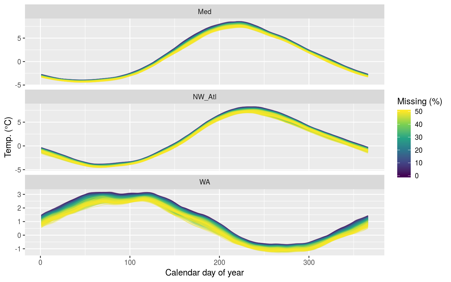
The 90th percentile thresholds created from time series with increasing percentages of missing data.
Expand here to see past versions of clim-miss-thresh-1.png:
| Version | Author | Date |
|---|---|---|
| fa7fd57 | robwschlegel | 2019-03-19 |
We see above that the 90th percentile threshold appears to decrease linearly the larger the percentage of missing data becomes. This is most pronounced for the Western Australia (WA) time series. This will likely have a significant impact on the size of the MHWs detected.
ANOVA p-values
Before we calculate the MHW metrics, let’s look at the output of an ANOVA comparing the seasonal and threshold values against one another across the different proportions of missing data for each time series.
# Run an ANOVA on each metric of the event results from
# the same amount of missing data and get the p-value
aov_p <- function(df){
  aov_models <- df[ , -grep("miss", names(df))] %>%
    map(~ aov(.x ~ df$miss)) %>%
    map_dfr(~ broom::tidy(.), .id = 'metric') %>%
    mutate(p.value = round(p.value, 4)) %>%
    filter(term != "Residuals") %>%
    select(metric, p.value)
  return(aov_models)
  }

# Run an ANOVA on each metric and then a Tukey test
aov_tukey <- function(df){
  aov_tukey <- df[ , -grep("miss", names(df))] %>%
    map(~ TukeyHSD(aov(.x ~ df$miss))) %>%
    map_dfr(~ broom::tidy(.), .id = 'metric') %>%
    mutate(p.value = round(adj.p.value, 4)) %>%
    # filter(term != "Residuals") %>%
    select(metric, comparison, adj.p.value) %>%
    # filter(adj.p.value <= 0.05) %>%
    arrange(metric, adj.p.value)
  return(aov_tukey)
}

# Quick wrapper for getting results for ANOVA and Tukey on clims
# df <- sst_ALL_miss_clim_only %>%
#   filter(site == "WA") %>%
#   select(-site)
clim_aov_tukey <- function(df){
  res <- df %>%
    # filter(miss != "0.00") %>%
    select(miss, seas, thresh) %>%
    mutate(miss = as.factor(miss)) %>%
    nest() %>%
    mutate(aov = map(data, aov_p),
           tukey = map(data, aov_tukey)) %>%
    select(-data)
  return(res)
}
# This file is not uploaded to GitHub as it is too large
# One must first run the above code locally to generate and save the file
load("data/sst_ALL_miss_clim_only.Rdata")
doMC::registerDoMC(cores = 50)
sst_ALL_miss_clim_aov_tukey <- plyr::ddply(sst_ALL_miss_clim_only, c("site", "rep"),
clim_aov_tukey, .parallel = T)
save(sst_ALL_miss_clim_aov_tukey, file = "data/sst_ALL_miss_clim_aov_tukey.Rdata")
# rm(sst_ALL_smooth, sst_ALL_smooth_aov_tukey)load("data/sst_ALL_miss_clim_aov_tukey.Rdata")
sst_ALL_miss_clim_aov <- sst_ALL_miss_clim_aov_tukey %>%
select(-tukey) %>%
unnest()
ggplot(sst_ALL_miss_clim_aov, aes(x = site, y = metric)) +
geom_tile(aes(fill = p.value)) +
geom_text(aes(label = round(p.value, 2))) +
scale_fill_gradient2(midpoint = 0.1)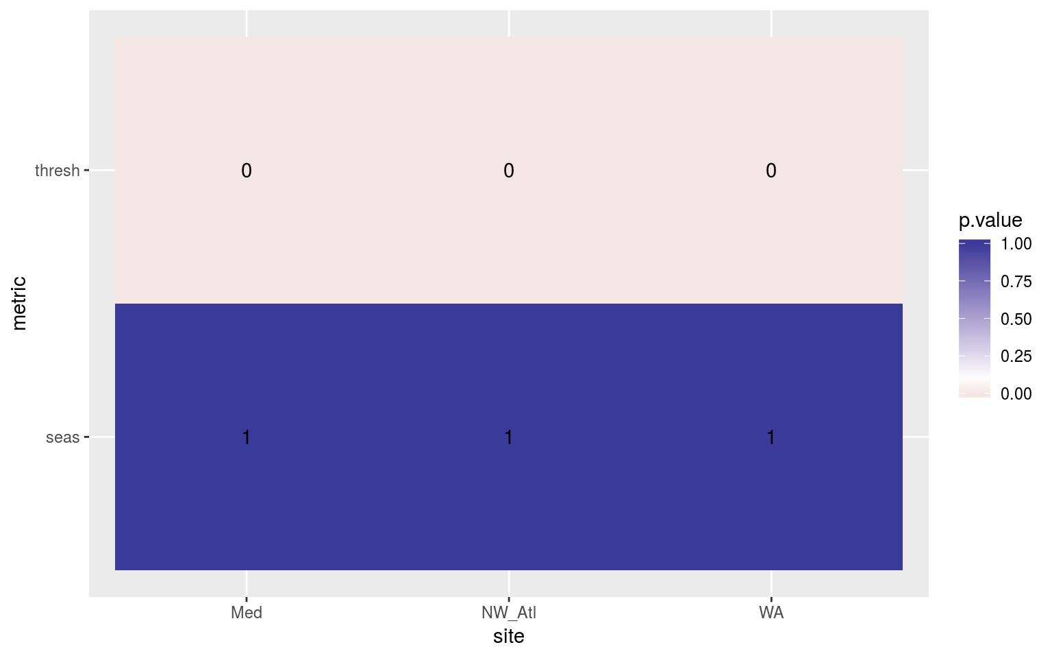
Heatmap showing the ANOVA results for the comparisons of the clim values for the different proportions of missing data. The 90th percentile thresholds are significantly different at p < 0.05 but the seasonal signals are not.
Expand here to see past versions of clim-miss-AOV-p-1.png:
| Version | Author | Date |
|---|---|---|
| fa7fd57 | robwschlegel | 2019-03-19 |
The difference for the 90th percentile thresholds from missing data significant, but the seasonal signals do not differ. At first the extreme contrast here seems odd, but if you think about it this is what we should expect, on average. Randomly removing data from a fixed sample we are just as likely to remove data above and below the mean, so the sample mean will not change. However, as we remove data we will reduce the size of the tails (on average) i.e. they will contract towards the median of the distribution. This will lead to an under-estimate of the 90th percentile, and an over-estimate of the 10th percentile. This means that as more data are missing in a time series, the more the threshold for what is considered a MHW will be lowered. Ideally we could come up with a recommended correction to the threshold given a proportion of missing data.
Post-hoc Tukey test
To get a more precise pictures of where these differences are occurring we will need to look at the post-hoc Tukey test results.
sst_ALL_miss_clim_tukey <- sst_ALL_miss_clim_aov_tukey %>%
  select(-aov) %>%
  unnest() %>%
  mutate(comparison = gsub("0.00", "1.00", comparison))

clim_tukey_sig <- sst_ALL_miss_clim_tukey %>%
  filter(adj.p.value <= 0.05) %>%
  separate(comparison, into = c("miss_small", "miss_large"), sep = "-") %>%
  mutate(miss_small = round((1-as.numeric(miss_small))*100),
         miss_large = round((1-as.numeric(miss_large))*100)) %>%
  mutate(miss_dif = round(miss_large - miss_small, 2))

# Need to correct for the tukey putting the 0% missing data on the wrong side
clim_tukey_sig_fix <- clim_tukey_sig %>%
  filter(miss_dif < 0) %>%
  mutate(miss_dif = abs(miss_dif))
colnames(clim_tukey_sig_fix)[3:4] <- c("miss_large", "miss_small")

# Apend the corrected data
clim_tukey_sig <- clim_tukey_sig %>%
  filter(miss_dif > 0) %>%
  rbind(clim_tukey_sig_fix)

# Create a summary for better plotting
clim_tukey_summary <- clim_tukey_sig %>%
  group_by(site, metric, miss_small) %>%
  summarise(range_bottom = min(miss_large),
            range_top = max(miss_large))
  # group_by(site, metric, miss_small)
  # mutate(miss_dif = round(miss_large - miss_small, 2)) %>%
  # group_by(site, metric, miss_large, miss_small, miss_dif) %>%
  # summarise(count = n()) %>%
  # ungroup() %>%
  # arrange(-miss_large, -miss_dif) %>%
  # mutate(miss_index = factor(paste0(miss_large,"-",miss_dif)),
         # miss_index = factor(miss_index, levels = unique(miss_index)))

ggplot(clim_tukey_summary, aes(x = miss_small)) +
  # geom_point() +
  # geom_errorbarh(aes(xmin = year_long, xmax = year_short)) +
  # geom_tile() +
  geom_segment(aes(xend = miss_small,
                   y = range_bottom, yend = range_top)) +
  facet_wrap(~site, ncol = 1) +
  # scale_x_reverse() +
  # scale_y_continuous(limits = c(1, 50)) +
  # scale_y_reverse() +
  labs(x = "Missing data (%)",
       y = "Missing data (%)")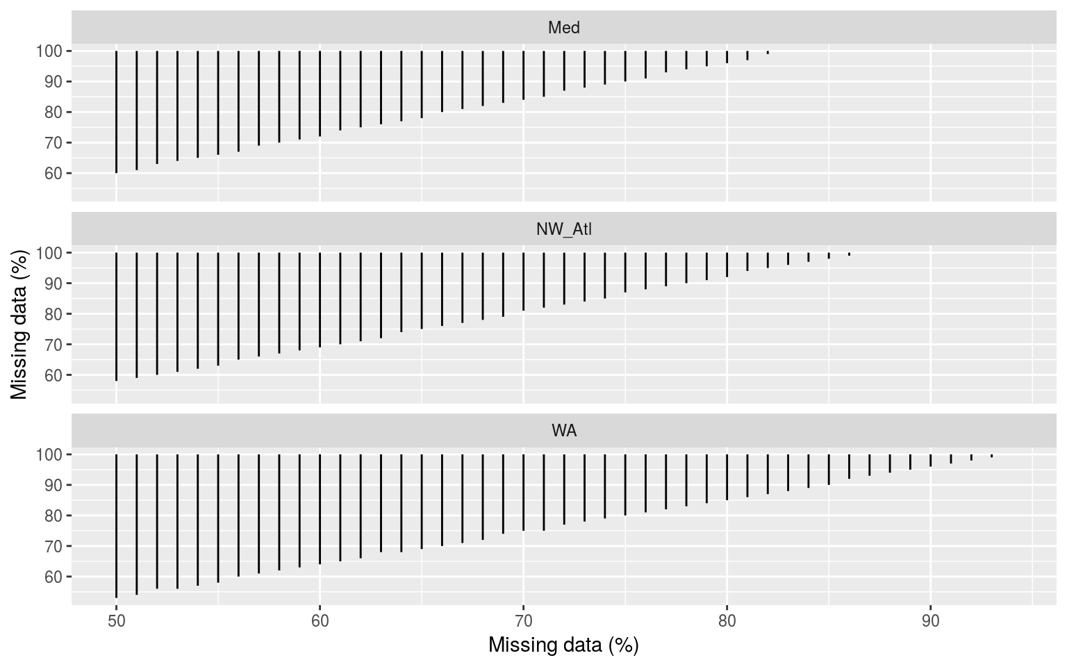
Segments showing the range of the percent of missing data present when climatologies were significantly different. The x and y axes show the percent of missing data.
Expand here to see past versions of clim-tukey-heat-1.png:
| Version | Author | Date |
|---|---|---|
| fa7fd57 | robwschlegel | 2019-03-19 |
The above figure shows the results of all possible pairwise comparisons from the ANOVA looking at the difference in threshold climatologies for different percentages of missing data. Curiously the time series missing no data do not seem to be significantly different from any of the missing data time series. I’m not convinced by this and will need to re-examine the results (a third time). Otherwise this figure shows us that the thresholds diverge from each other very quickly.
Ultimately I don’t think this is very useful.
Confidence intervals
# Calculate the 97.5th, 50th, and 2.5th quantiles to get the CI of each metric
# df <- sst_ALL_miss_clim_only %>%
  # filter(site == "WA") %>%
  # select(-doy, -rep, -site)
metric_CI <- function(df){
  res <- df %>%
    group_by(miss) %>%
    gather(key = metric, value = val, -miss) %>%
    group_by(miss, metric) %>%
    summarise(quant_50 = quantile(val, probs = 0.5),
              quant_2.5 = quantile(val, probs = 0.025),
              quant_97.5 = quantile(val, probs = 0.975))
  return(res)
  }

# The quantile based 95% confidence intervals
sst_ALL_miss_clim_CI <- sst_ALL_miss_clim_only %>%
  select(-doy, -rep) %>%
  mutate(miss = miss) %>%
  group_by(site) %>%
  nest() %>%
  mutate(res = map(data, metric_CI)) %>%
  select(-data) %>%
  unnest()

ggplot(filter(sst_ALL_miss_clim_CI, metric != "seas"),
       aes(x = as.factor(miss))) +
  geom_errorbar(position = position_dodge(0.9), width = 0.5,
                aes(ymin = quant_2.5, ymax = quant_97.5)) +
  geom_point(aes(y = quant_50)) +
  facet_wrap(~site, scales = "free_y", ncol = 1) +
  labs(x = "Missing data (%)", y = "Temp. (°C)")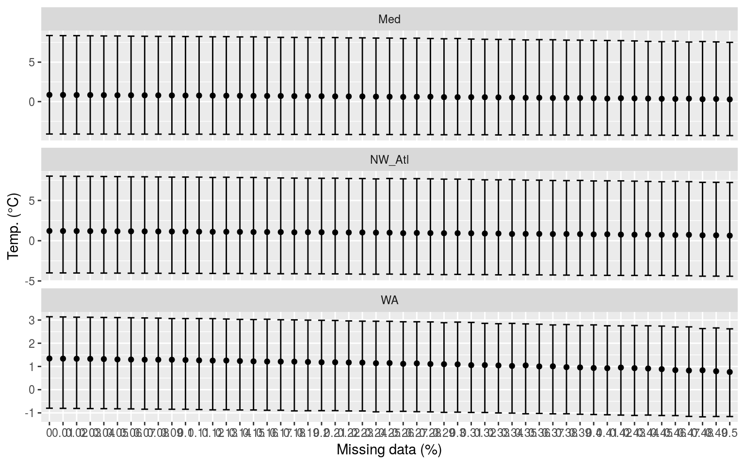
Confidence intervals of the MHW metrics for each missing data step for all three time series.
Expand here to see past versions of clim-miss-CI-plot-1.png:
| Version | Author | Date |
|---|---|---|
| fa7fd57 | robwschlegel | 2019-03-19 |
Whereas p-values do have a use, I find confidence intervals to allow for a better judgement of the relationship between categories of data. The seasonal signal is not included in the above figure as any changes caused by missing data are nearly imperceptible. With the 90th percentile threshold (thresh) however, the more data are missing the lower the 90th percentile threshold tends to become. This appears to be because the seasonal signal is a smooth composite of the available data whereas the 90th percentile threshold is affected by large amounts of missing data because that prevents the accurate creation of the 90th percentile thresholds due to the many large (outlier-like, but real) values that are not included in the calculation, which by necessity requires large values to be calculated accurately.
Overall this analysis/figure is not very helpful.
Kolmogorov-Smirnov
# Extract the true climatologies
sst_ALL_miss_clim_only_0 <- sst_ALL_miss_clim_only %>%
  filter(miss == 0, rep == "1")

# KS function
# Takes one rep of missing data and compares it against the complete signal
clim_KS_p <- function(df){
  df_comp <- sst_ALL_miss_clim_only_0 %>%
    filter(site == df$site[1])
  res <- data.frame(site = df$site[1],
                    seas = round(ks.test(df$seas, df_comp$seas)$p.value, 4),
                    thresh = round(ks.test(df$thresh, df_comp$thresh)$p.value, 4))
  return(res)
}

# The KS results
suppressWarnings( # Suppress perfect match warnings
sst_ALL_miss_clim_KS_p <- sst_ALL_miss_clim_only %>%
  filter(miss != 0) %>%
  mutate(miss = as.factor(miss)) %>%
  mutate(site2 = site) %>%
  group_by(site2, miss, rep) %>%
  nest() %>%
  mutate(res = map(data, clim_KS_p)) %>%
  select(-data) %>%
  unnest() %>%
  select(site, miss, rep, seas, thresh) %>%
  gather(key = metric, value = p.value, -site, - miss, -rep)
)
save(sst_ALL_miss_clim_KS_p, file = "data/sst_ALL_miss_clim_KS_p.Rdata")
load("data/sst_ALL_miss_clim_KS_p.Rdata")
# Filter non-significant results
KS_sig <- sst_ALL_miss_clim_KS_p %>%
filter(p.value <= 0.05) %>%
group_by(site, miss, metric) %>%
summarise(count = n()) %>%
ungroup() %>%
mutate(miss = as.numeric(as.character(miss))) %>%
# There are three "seas" results from "WA" that are significant
# But that isnt enough to bother visualising here
filter(metric == "thresh") %>%
select(site, metric, miss, count)
# Manually pad in NA for missing percentages with no significant differences
KS_sig <- rbind(KS_sig, data.frame(site = "Med", metric = "thresh",
miss = seq(0, 0.26, 0.01), count = NA))
KS_sig <- rbind(KS_sig, data.frame(site = "NW_Atl", metric = "thresh",
miss = seq(0, 0.21, 0.01), count = NA))
KS_sig <- rbind(KS_sig, data.frame(site = "WA", metric = "thresh",
miss = seq(0, 0.08, 0.01), count = NA))
ggplot(KS_sig, aes(x = miss*100, y = site)) +
geom_line(aes(colour = count, group = site), size = 3) +
facet_wrap(~metric, ncol = 1) +
scale_colour_viridis_c() +
# scale_x_reverse(breaks = seq(5, 35, 5)) +
labs(x = "Missing data (%)", y = NULL,
colour = "Sig. dif.\nout of 100")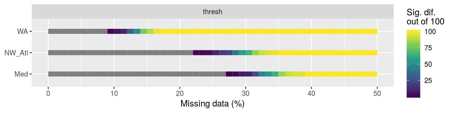
Line plot showing the p-value results from KS tests comparing the distributions of each of the 100 replicated climatology statistics against the true (no missing data) climatologies for each of the three reference time series.
Expand here to see past versions of KS-clims-1.png:
| Version | Author | Date |
|---|---|---|
| fa7fd57 | robwschlegel | 2019-03-19 |
As we se in the line graph above, it is the Western Australia (WA) time series that most quickly deviate from the real signal when missing data are introduced. I think this is due to a combination of two things. The first is that the smaller the seasonal signal is, the more sensitive the data are when trying to create an accurate climatology. The second reason is that the more variance there is in a time series, apart from the seasonal signal, the more sensitive the data are to accurate climatology creation. The WA time series hits both of these problems and so this comes through clearly in the results.
Correlations
# Create wide joiined data frame
suppressWarnings(
sst_ALL_miss_joined <- sst_ALL_miss_clim_KS_p %>%
  left_join(sst_ALL_con, by = c("site", "miss", "rep")) %>%
  spread(key = duration, value = count)
)

# Run correlations
suppressWarnings( # Supress warnings from small sample sizes
sst_ALL_miss_cor <- sst_ALL_miss_joined %>%
  group_by(site, metric) %>%
  do(data.frame(t(cor(.[,6:ncol(sst_ALL_miss_joined)],
                      .[,5], use = "pairwise.complete.obs")))) %>%
  gather(key = duration, value = r, -metric, -site) %>%
  mutate(duration = as.numeric(gsub("X", "", duration)))
)

ggplot(sst_ALL_miss_cor, aes(x = duration, y = r)) +
  geom_point() +
  # scale_fill_viridis_d() +
  geom_hline(aes(yintercept = 0.0)) +
  scale_x_continuous(limits = c(1, 14), breaks = seq(1, 13, 3)) +
  facet_grid(site~metric) +
  labs(x = "Consecutive missing days",
       y = "Correlation (r) between significance\nand count of consecutive days missing")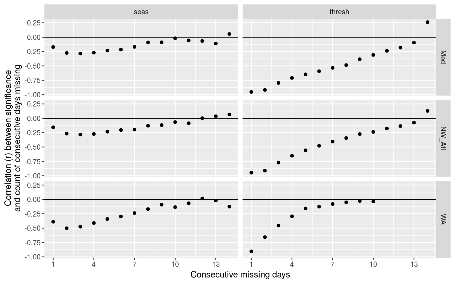
Dot plot showing the relationship between number of consecutive missing days and the significant difference of that climatology as determined by KS tests. Consecutive missing days are a much better predictor for thresholds than for seasonal signals.
Expand here to see past versions of clim-cor-1.png:
| Version | Author | Date |
|---|---|---|
| fa7fd57 | robwschlegel | 2019-03-19 |
This plot shows the count of consecutive days of missing data is a very good indicator of whether or not the 90th percentile threshold will be significantly different from the control time series. This works best for counts of consecutive days below 5, and works a bit more poorly for the WA time series.
It must now be seen what the relationship is between count of consecutive missing days at each day step and the corresponding p-values.
MHW metrics
Now that we know that missing data from a time series does produce significantly different 90th percentile thresholds, we want to see what the downstream effects are on the MHW metrics.
ANOVA
# Quick wrapper for getting results for ANOVA and Tukey on event metrics
# df <- sst_ALL_miss_clim_event_cat %>%
#   filter(site == "WA") %>%
#   select(-site)
event_aov_tukey <- function(df){
  res <- df %>%
    select(-cats) %>%
    unnest(events) %>%
    filter(row_number() %% 2 == 0) %>%
    unnest(events) %>%
    # select(miss) %>%
    # filter(miss != "0.00") %>%
    select(miss, duration, intensity_mean, intensity_max, intensity_cumulative) %>%
    mutate(miss = as.factor(miss)) %>%
    nest() %>%
    mutate(aov = map(data, aov_p),
           tukey = map(data, aov_tukey)) %>%
    select(-data)
  return(res)
}

# This file is not uploaded to GitHub as it is too large
# One must first run the above code locally to generate and save the file
load("data/sst_ALL_miss_clim_event_cat.Rdata")
doMC::registerDoMC(cores = 50)
sst_ALL_miss_event_aov_tukey <- plyr::ddply(sst_ALL_miss_clim_event_cat, c("site", "rep"),
                                            event_aov_tukey, .parallel = T)
save(sst_ALL_miss_event_aov_tukey, file = "data/sst_ALL_miss_event_aov_tukey.Rdata")
# rm(sst_ALL_smooth, sst_ALL_smooth_aov_tukey)
load("data/sst_ALL_miss_event_aov_tukey.Rdata")
# ANOVA p
sst_ALL_miss_event_aov_p <- sst_ALL_miss_event_aov_tukey %>%
select(-tukey) %>%
unnest()
event_aov_plot <- sst_ALL_miss_event_aov_p %>%
group_by(site, metric) %>%
filter(p.value <= 0.05) %>%
summarise(count = n())
# visualise
ggplot(event_aov_plot, aes(x = site, y = metric)) +
geom_tile(aes(fill = count)) +
geom_text(aes(label = count)) +
scale_fill_viridis_c() +
theme(axis.text.y = element_text(angle = 90, hjust = 0.5))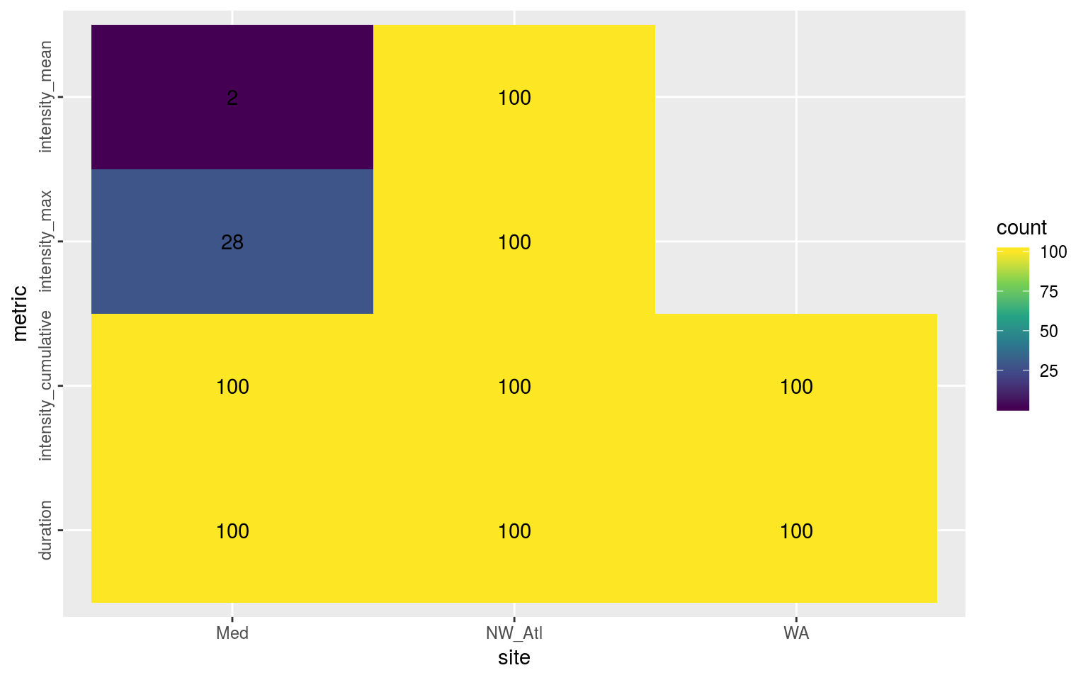
Heatmap showing the ANOVA results for the comparisons of the main four MHW metrics for all proportions of missing data per reference time series. The differences are significant (p <0.05) for all of the metrics.
Expand here to see past versions of event-aov-plot-1.png:
| Version | Author | Date |
|---|---|---|
| fa7fd57 | robwschlegel | 2019-03-19 |
As we may see in the figure above, the duration (and likely therefore cummulative intensity) of events always differed significantly when missing data were introduced into a time series. For the NW_Atl time series all of the metrics were always significantly different, with mean and max intensities occassionally being different for Med, and never for WA. To see where these differences materialise we will visualise the post-hoc Tukey test results.
Post-hoc Tukey test
sst_ALL_miss_event_tukey <- sst_ALL_miss_event_aov_tukey %>%
  select(-aov) %>%
  unnest()

# Create a summary for better plotting
event_tukey_summary <- sst_ALL_miss_event_tukey %>%
  separate(comparison, into = c("comp_left", "comp_right"), sep = "-") %>%
  mutate(comp_left = as.numeric(comp_left),
         comp_right = as.numeric(comp_right)) %>%
  filter(comp_left == 0 | comp_right == 0) %>%
  mutate(comp_dif = abs(round(comp_right - comp_left, 2))) %>%
  filter(adj.p.value <= 0.05) %>%
  group_by(site, metric, comp_dif) %>%
  summarise(count = n())

ggplot(event_tukey_summary, aes(x = comp_dif*100, y = site)) +
  geom_line(aes(colour = count)) +
  geom_point(aes(colour = count), size = 0.5) +
  facet_wrap(~metric, ncol = 1) +
  scale_colour_viridis_c() +
  # scale_x_reverse(breaks = seq(5, 35, 5)) +
  labs(x = "Missing data (%)", y = NULL,
       colour = "Sig. dif.\nout of 100")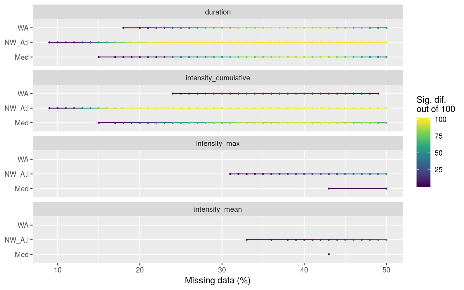
Segments showing the range of the percent of missing data present when climatologies were significantly different.
Expand here to see past versions of event-tukey-line-1.png:
| Version | Author | Date |
|---|---|---|
| fa7fd57 | robwschlegel | 2019-03-19 |
The figure above shows that significant differences in the duration (and therefore cummulative intensity) of events begins occurring as soon as 9% of data are missing in the NW_Atl time series, 15% in Med, and 18% in WA. Only the NW_Atl showed any real signs of significant differences for max and mean intensities and these don’t begin until 31%.
Confidence intervals
# Run an ANOVA on each metric of the combined event results and get CI
# event_aov_CI <- function(df){
#   # Run ANOVAs
#   aov_models <- df[ , -grep("miss", names(df))] %>%
#     map(~ aov(.x ~ df$miss)) %>%
#     map_dfr(~ confint_tidy(.), .id = 'metric') %>%
#     # mutate(miss = as.factor(rep(c("0", "0.1", "0.25", "0.5"), nrow(.)/4))) %>%
#     select(metric, miss, everything())
#   # Calculate population means
#   df_mean <- df %>%
#     group_by(miss) %>%
#     summarise_all(.funs = mean) %>%
#     gather(key = metric, value = conf.mid, -miss)
#   # Correct CI for first category
#   res <- aov_models %>%
#     left_join(df_mean, by = c("metric", "miss")) %>%
#     mutate(conf.low = if_else(miss == 0, conf.low - conf.mid, conf.low),
#            conf.high = if_else(miss == 0, conf.high - conf.mid, conf.high)) %>%
#     select(-conf.mid)
#   return(res)
#   }
load("data/sst_ALL_miss_clim_event_cat.Rdata")
# The ANOVA confidence intervals
sst_ALL_miss_event_CI <- sst_ALL_miss_clim_event_cat %>%
select(-cats) %>%
unnest(events) %>%
filter(row_number() %% 2 == 0) %>%
unnest(events) %>%
select(site, miss, duration, intensity_mean, intensity_max, intensity_cumulative) %>%
mutate(miss = as.factor(miss)) %>%
nest(-site) %>%
mutate(res = map(data, metric_CI)) %>%
select(-data) %>%
unnest()
save(sst_ALL_miss_event_CI, file = "data/sst_ALL_miss_event_CI.Rdata")load("data/sst_ALL_miss_event_CI.Rdata")
ggplot(sst_ALL_miss_event_CI, aes(x = as.factor(miss))) +
geom_errorbar(position = position_dodge(0.9), width = 0.5,
aes(ymin = quant_2.5, ymax = quant_97.5)) +
geom_point(aes(y = quant_50)) +
facet_grid(metric~site, scales = "free_y") +
labs(x = "Missing data (%)", y = NULL)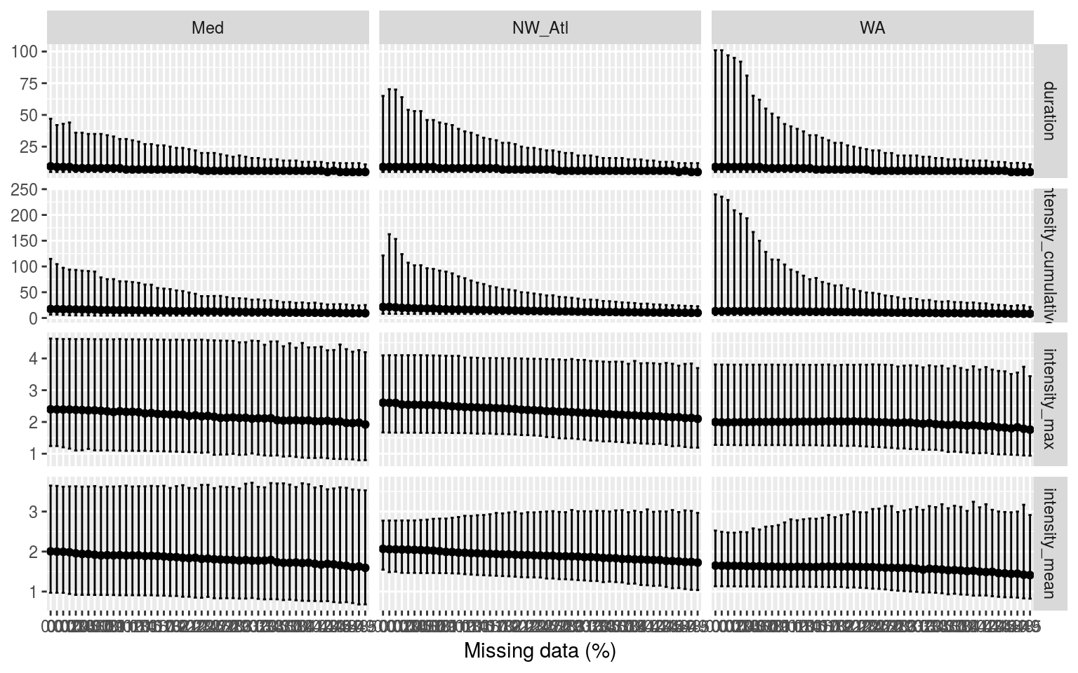
Confidence intervals of the different metrics for the different proportions of missing data. Note that the y-axes are not the same.
Expand here to see past versions of event-miss-CI-plot-1.png:
| Version | Author | Date |
|---|---|---|
| fa7fd57 | robwschlegel | 2019-03-19 |
There is generally a slight decrease in the max and mean intensity of events as one increases the amounts of missing data, but the range of these values also tends to increase. This is important to note as it means that one may not say with certainty that the more data are missing from a time series, the less intense the MHWs detected will be. We see however that the median duration and cum. intensity are rather similar for all missing data steps.
As the proportion of missing data are increased, the climatological means stay the same (so anomalies are unchanged) but the thresholds are reduced. Therefore, events will start and end at smaller temperature anomalies thus bringing down the mean intensity but raising the duration. We do not howeversee this increase in duration due to the fact that all of these missing days start dividing up the events into multiple shorter events. More on this in the categories section.
Correlations
# Create wide joiined data frame
sst_ALL_miss_event_joined <- sst_ALL_miss_event_tukey %>%
  separate(comparison, into = c("comp_left", "comp_right"), sep = "-") %>%
  mutate(comp_left = as.numeric(comp_left),
         comp_right = as.numeric(comp_right)) %>%
  filter(comp_left == 0 | comp_right == 0) %>%
  mutate(miss = as.character(abs(round(comp_right - comp_left, 2)))) %>%
  select(site, miss, rep, metric, adj.p.value) %>%
  left_join(sst_ALL_con, by = c("site", "miss", "rep"))

sst_ALL_miss_event_joined_wide <- sst_ALL_miss_event_joined %>%
  spread(key = duration, value = count)

# Run correlations
suppressWarnings( # Supress warnings from small sample sizes
sst_ALL_miss_event_cor <- sst_ALL_miss_event_joined_wide %>%
  group_by(site, metric) %>%
  do(data.frame(t(cor(.[,6:ncol(sst_ALL_miss_event_joined_wide)],
                      .[,5], use = "pairwise.complete.obs")))) %>%
  gather(key = duration, value = r, -metric, -site) %>%
  mutate(duration = as.numeric(gsub("X", "", duration)))
)

ggplot(sst_ALL_miss_event_cor, aes(x = duration, y = r)) +
  geom_point() +
  # scale_fill_viridis_d() +
  geom_hline(aes(yintercept = 0.0)) +
  scale_x_continuous(limits = c(1, 14), breaks = seq(1, 13, 3)) +
  facet_grid(site~metric) +
  labs(x = "Consecutive missing days",
       y = "Correlation (r) between significance\nand count of consecutive days missing")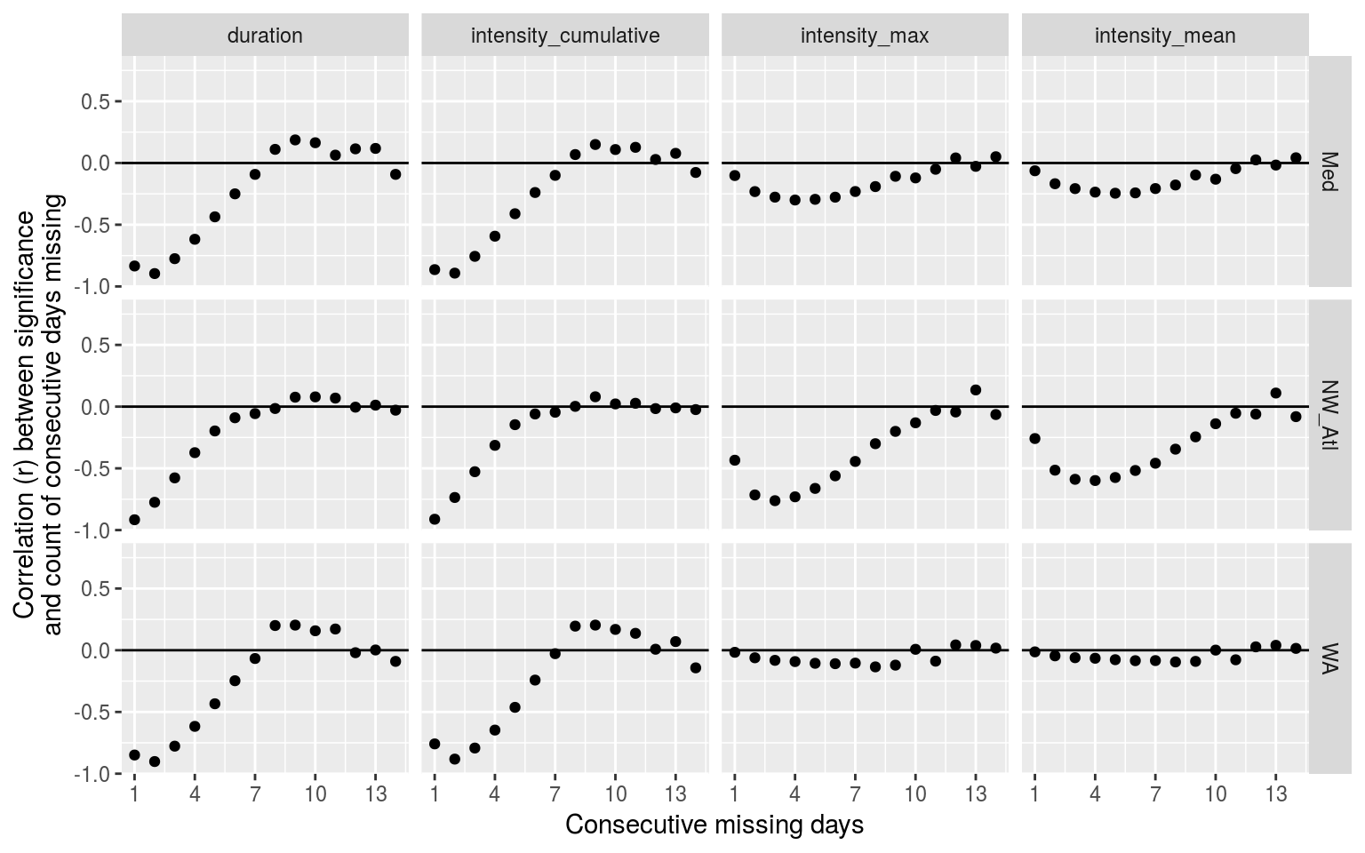
Dot plot showing the relationship between number of consecutive missing days and the significant difference of the MHW metric from the control.
Expand here to see past versions of event-cor-1.png:
| Version | Author | Date |
|---|---|---|
| fa7fd57 | robwschlegel | 2019-03-19 |
The correlations shown above as dot plots tell us that the count of consecutive missing days from 1 – 3 are a very good indicator of whether or not the duration (and int. cum.) will be significantly different from a time series with no missing data. For intensity max and mean it looks like the count of consecutive missing days from 4 – 6 is the best indicator, with no real pattern emerging for the WA time series.
ggplot(filter(sst_ALL_miss_event_joined, duration <= 8),
       aes(x = count, y = adj.p.value, colour = as.factor(duration))) +
  geom_point(alpha = 0.1) +
  geom_smooth(method = "lm", se = F) +
  scale_y_continuous(expand = c(0, 0)) +
  facet_grid(metric~site) +
  labs(y = "p-value", colour = "Consecutive\nmissing days")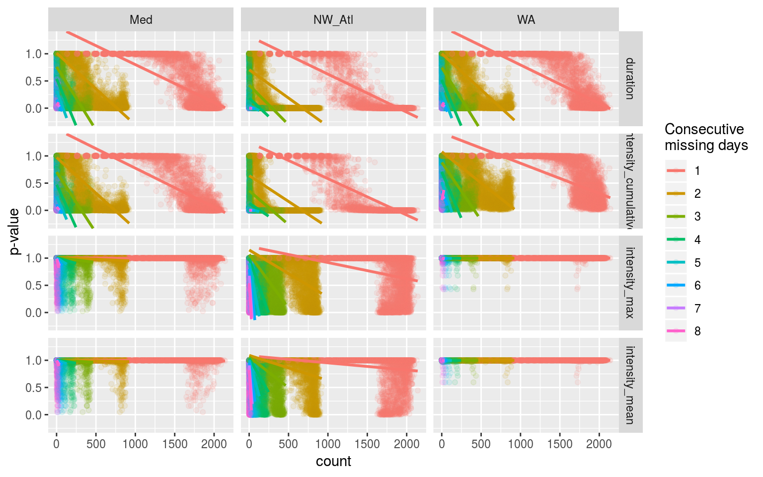
Linear models showing the relationship between count of consecutive missing days in a time series and the probability (p-value) that the time series will be different from the control.
Expand here to see past versions of event-cor-linear-plot-1.png:
| Version | Author | Date |
|---|---|---|
| fa7fd57 | robwschlegel | 2019-03-19 |
The figure above shows that the relationships between the count of consecutive missing days and the p-value comparing that time series against the control is srongest for duration (and int. cum.) at lower consecutive missing day, but that the strength of this relationship is due to the tails at the top and bottom of the distribution of results and so this isn’t necessarily as good of a predictor as it may have initially looked. This is more a case of large sample sizes producing sexy results. That being said, coount of consecutive missing days at 2 and 3 may be useful later on in the best practices.
Categories
chi-squared
In order to detemine if the count of MHW categories differs based on the percent of missing data, we will be performing a series of chi-squared tests for each site and rep. We will combine category 3 and 4 events together as this will make the resuls more robust and we are interested specifically in how these two categories differ more so than the other smaller two categories.
# Load and extract category data
load("data/sst_ALL_miss_clim_event_cat.Rdata")
suppressWarnings( # Suppress warning about category levels not all being present
sst_ALL_miss_cat <- sst_ALL_miss_clim_event_cat %>%
  select(-events) %>%
  unnest()
)

# Prep the data for better chi-squared use
sst_ALL_miss_cat_prep <- sst_ALL_miss_cat %>%
  select(miss, rep, site, category) %>%
  mutate(category = ifelse(category == "III Severe", "III & IV", category),
         category = ifelse(category == "IV Extreme", "III & IV", category))

# Extract the true climatologies
sst_ALL_miss_cat_only_0 <- sst_ALL_miss_cat_prep %>%
  filter(miss == 0, rep == "1") %>%
  select(site, miss, category)

# chi-squared pairwise function
# Takes one rep of missing data and compares it against the complete data
# df <- sst_ALL_miss_cat_prep %>%
  # filter(site == "WA", rep == "20", miss == 0.1)
# df <- unnest(slice(sst_ALL_miss_cat_chi,1)) %>%
  # select(-site2, -rep, -miss2)
chi_pair <- function(df){
  # Prep data
  df_comp <- sst_ALL_miss_cat_only_0 %>%
    filter(site == df$site[1])
  df_joint <- rbind(df, df_comp)
  # Run tests
  res <- chisq.test(table(df_joint$miss, df_joint$category), correct = FALSE)
  res_broom <- broom::augment(res) %>%
    mutate(p.value = broom::tidy(res)$p.value)
  return(res_broom)
}

# The pairwise chai-squared results
suppressWarnings( # Suppress poor match warnings
sst_ALL_miss_cat_chi <- sst_ALL_miss_cat_prep %>%
  filter(miss != 0) %>%
  # mutate(miss = as.factor(miss)) %>%
  mutate(site2 = site,
         miss2 = miss) %>%
  group_by(site2, miss2, rep) %>%
  nest() %>%
  mutate(chi = map(data, chi_pair)) %>%
  select(-data) %>%
  unnest() %>%
  dplyr::rename(site = site2, miss = miss2,
                miss_comp = Var1, category = Var2)
)
save(sst_ALL_miss_cat_chi, file = "data/sst_ALL_miss_cat_chi.Rdata")
load("data/sst_ALL_miss_cat_chi.Rdata")
sst_ALL_miss_cat_chi_sig <- sst_ALL_miss_cat_chi %>%
filter(p.value <= 0.05) %>%
select(site, miss, p.value) %>%
group_by(site, miss) %>%
unique() %>%
summarise(count = n())
knitr::kable(sst_ALL_miss_cat_chi_sig, caption = "Table showing the count out of 100 for significant differences (_p_-value) for the count of different categories of events for each site based on the amount of missing data present.")load("data/sst_ALL_miss_cat_chi.Rdata")
# Prep data for plotting
chi_sig <- sst_ALL_miss_cat_chi %>%
filter(p.value <= 0.05) %>%
select(site, miss, p.value) %>%
group_by(site, miss) %>%
unique() %>%
summarise(count = n())
ggplot(chi_sig, aes(x = as.numeric(miss)*100, y = site)) +
geom_line(aes(colour = count, group = site)) +
# facet_wrap(~metric, ncol = 1) +
scale_colour_viridis_c() +
scale_x_continuous() +
labs(x = "Missing data (%)", y = NULL,
colour = "Sig. dif.\nout of 100") +
theme(axis.text.x = element_text(angle = 20))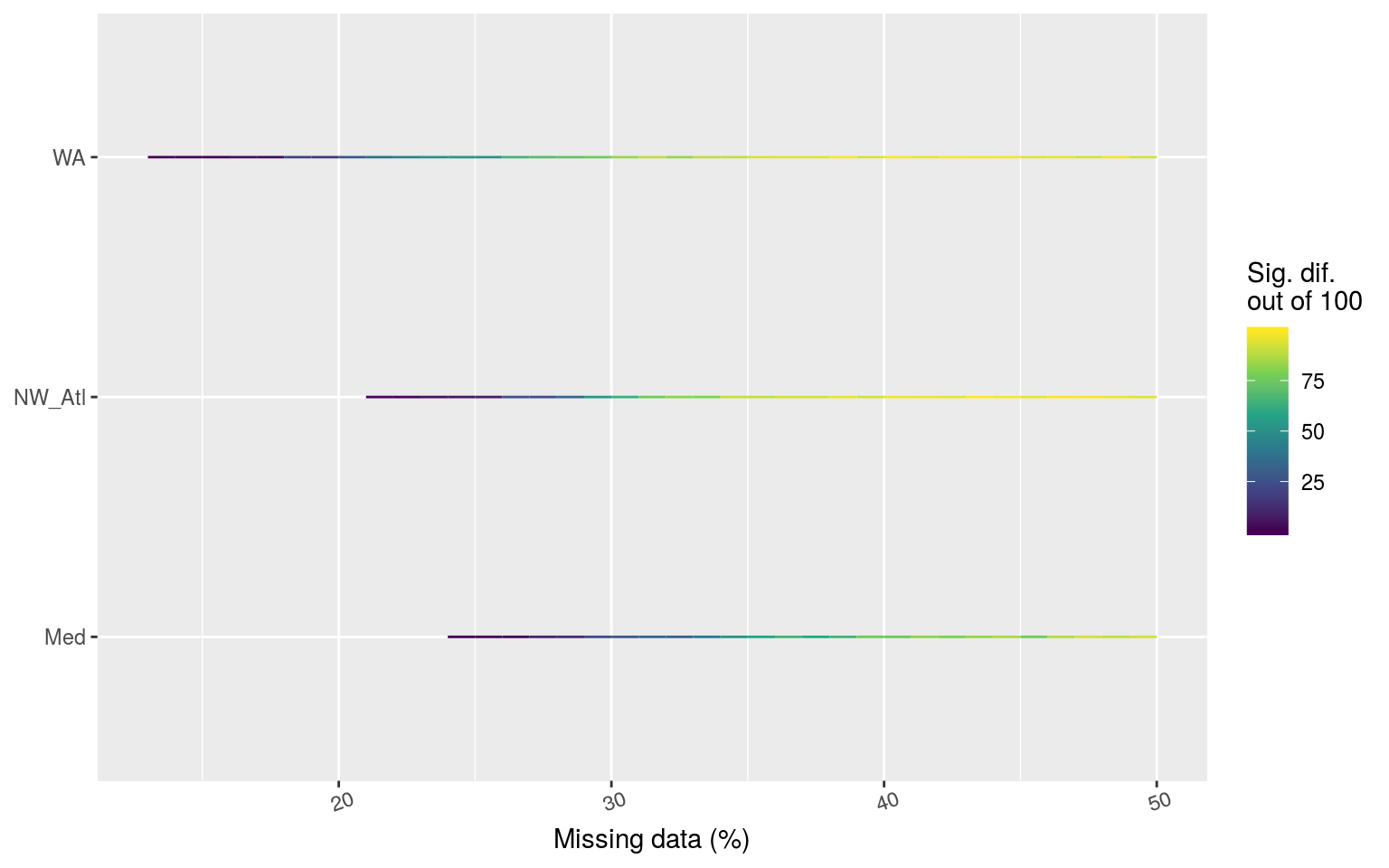
Line graph showing the count of times out of 100 random replicates when a given percentage of missing data led to significant differences in the count of categories of MHWs as determined by a chi-squared test.
Expand here to see past versions of chi-pair-plot-1.png:
| Version | Author | Date |
|---|---|---|
| fa7fd57 | robwschlegel | 2019-03-19 |
The line plot above shows at what point the category counts begin to differ significantly from time series with no missing data. The difference in count appears to be realted to the variance in the time series, with the WA becoming different the quickest, and the Med the slowest.
Post-hoc chi-squared
It is also necessary to see which of the categories specifically are differing significantly. Unfortunately there is no proper post-hoc chi-squared test. Instead it is possible to look at the standardised residuals for each category within the pairwise comparisons being made.
I still need to do this…
Correlations
It would also be useful to look at the correlations between consecutive missing days of data and significantly different counts of categories.
Non-random missing data
There are two realistic instances of consistent missing data in SST time series. The first is for polar data when satellites cannot collect data because the sea surface is covered in ice. Whereas this would obviously preclude any MHWs from occurring, the question here is how do long stretches of missing data affect the creation of the climatologies, and therefore the detection of MHWs. The other sort of consecutive missing data is for those in situ time series that are collected by hand by (likely) a government employee that does not work on weekends. In the following two sub-sections we will knock-out data intentionally to simulate these two issues. Lastly, because we have seen above that consecutive missing days of data are problematic, in addition to looking at the effects of missing weekends (2 consecutive days), we will also look at the effect of 3 and 4 consecutive missing days. I assume that four constant consecutive missing days will render the time series void, but three may be able to squeak by.
Ice coverage
To simulate ice cover we will remove the three winter months from each time series. Because two of the three time series are from the northern hemisphere, the times removed will not be the same for all time series.
load("data/sst_ALL_detrend.Rdata")
# Knock-out ice coverage
sst_WA_ice <- sst_ALL_detrend %>%
  filter(site == "WA") %>%
  mutate(month = month(t, label = T),
         temp = ifelse(month %in% c("Jul", "Aug", "Sep"), NA, temp)) %>%
  select(-month)
sst_Med_ice <- sst_ALL_detrend %>%
  filter(site == "Med") %>%
  mutate(month = month(t, label = T),
         temp = ifelse(month %in% c("Jan", "Feb", "Mar"), NA, temp)) %>%
  select(-month)
sst_NW_Atl_ice <- sst_ALL_detrend %>%
  filter(site == "NW_Atl") %>%
  mutate(month = month(t, label = T),
         temp = ifelse(month %in% c("Jan", "Feb", "Mar"), NA, temp)) %>%
  select(-month)
sst_ALL_ice <- rbind(sst_WA_ice, sst_NW_Atl_ice, sst_Med_ice)
rm(sst_WA_ice, sst_NW_Atl_ice, sst_Med_ice)

# visualise
ggplot(sst_ALL_ice, aes(x = t, y = temp)) +
  geom_line(data = sst_ALL_detrend, alpha = 0.2) +
  geom_line(aes(colour = site)) +
  facet_wrap(~site, scales = "free_y", ncol = 1) +
  labs(x = "", y = "temp. (C)")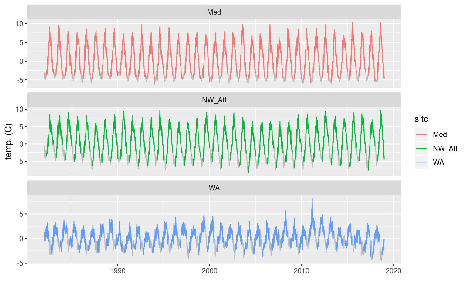
The three time series with artificial ice cover in the winter months removed. The missing data may be seen as a faint grey line filling in the winter months.
Expand here to see past versions of ice-cover-line-1.png:
| Version | Author | Date |
|---|---|---|
| fa7fd57 | robwschlegel | 2019-03-19 |
In the figure above we see that removing the winter months for the Mediterranean and Northwest Atlantic time series produces relatively even missing gaps near the bottom of each seasonal cycle. The Western Australia time series appears to have a much less regular seasonal signal and so the missing data periods vary somewhat more.
# Calculate the thresholds for all of the created time series
sst_ALL_ice_clim <- sst_ALL_ice %>%
  group_by(site) %>%
  nest() %>%
  mutate(clim = map(data, ts2clm, climatologyPeriod = c("1982-01-01", "2014-12-31"))) %>%
  select(-data) %>%
  unnest()

# Pull out the clims only
sst_ALL_ice_clim_only <- sst_ALL_ice_clim %>%
  select(-t, -temp) %>%
  unique() %>%
  arrange(site, doy)
Climatology statistics
Before we begin comparing the climatology statistics for ‘ice coverage’ vs. complete time series, let’s see what the seasonal climatologies look like alongside each other.
sst_ALL_miss_clim_only_0 <- sst_ALL_miss_clim_only %>%
  filter(miss == 0, rep == "1")

ggplot(sst_ALL_ice_clim_only, aes(x = doy, y = seas)) +
  geom_line(data = sst_ALL_miss_clim_only_0, alpha = 0.2) +
  geom_line(aes(colour = site)) +
  facet_wrap(~site, scales = "free_y", ncol = 1) +
  labs(x = "", y = "temp. (C)")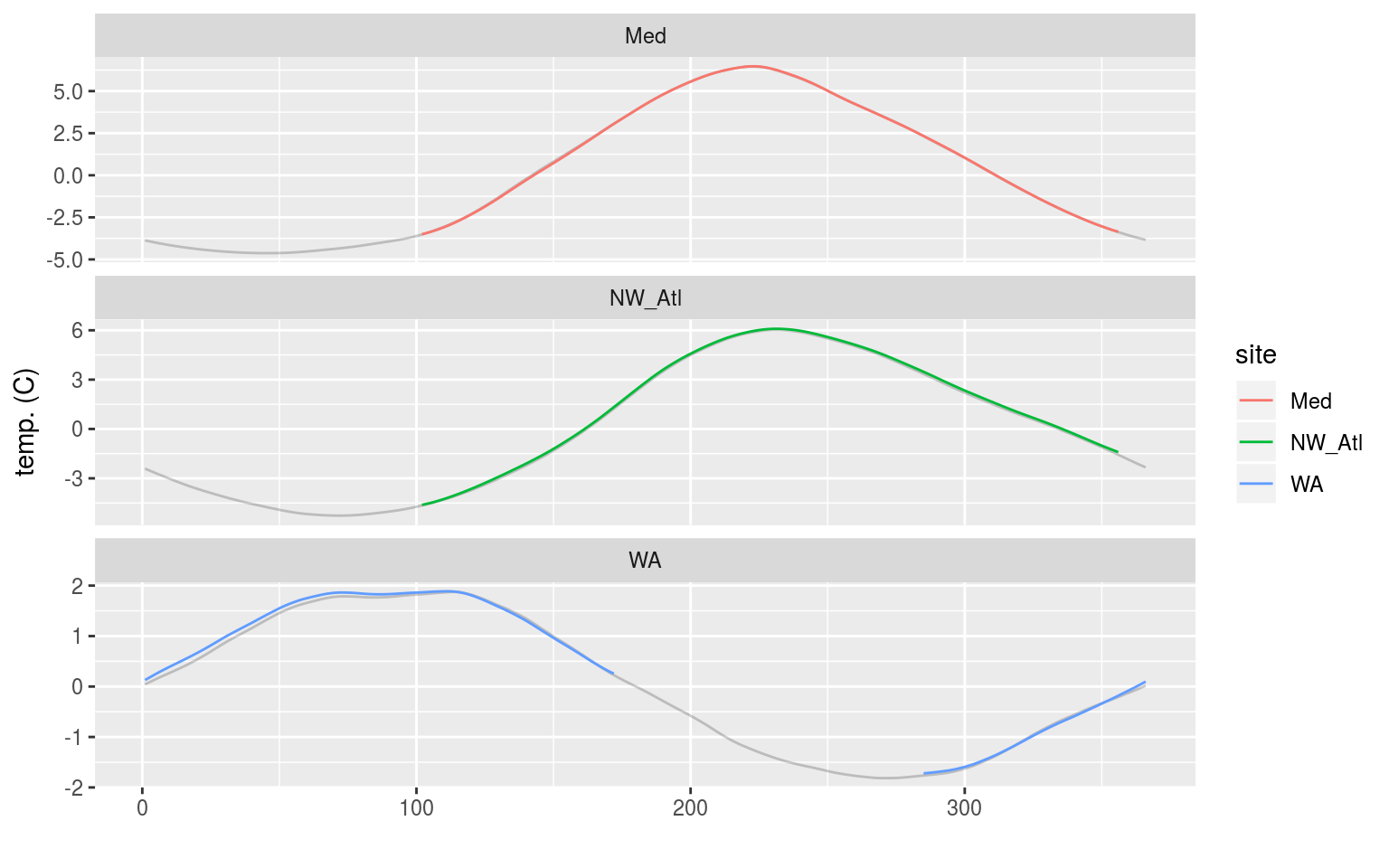
Line graph showing the seasonal signal calculated from time series with a simulated 3 months of ice coverage. The seasonal signal based on the complete time series is shown in grey behind.
Expand here to see past versions of ice-seas-1.png:
| Version | Author | Date |
|---|---|---|
| fa7fd57 | robwschlegel | 2019-03-19 |
We may see in the figure above that the calculated seasonal climatologies from the ‘ice coverage’ time series appear to be nearly identical to those from complete time series. The WA does however look to be slightly different.
t-test p-values
For the following tests we are only going to compare data between the complete and ice coverage time series for days in which data exist. Doing otherwise would unfairly bias the results.
# df <- slice(sst_ALL_ice_clim_ttest_p, 1) %>%
#   unnest()
clim_ttest_p_ice <- function(df){
  df_na <- df %>%
    na.omit()
  df_comp <- sst_ALL_miss_clim_only_0 %>%
    filter(site == df$site[1],
           doy %in% df_na$doy)
  res <- data.frame(site = df$site[1],
                    seas = t.test(df$seas, df_comp$seas)$p.value,
                    thresh = t.test(df$thresh, df_comp$thresh)$p.value)
  return(res)
}

# The t-test results
sst_ALL_ice_clim_ttest_p <- sst_ALL_ice_clim_only %>%
  mutate(site_i = site) %>%
  group_by(site_i) %>%
  nest() %>%
  mutate(res = map(data, clim_ttest_p_ice)) %>%
  select(-data) %>%
  unnest() %>%
  select(site, seas:thresh) %>%
  gather(key = stat, value = p.value, -site)

# visualise
ggplot(sst_ALL_ice_clim_ttest_p, aes(x = site, y = stat)) +
  geom_tile(aes(fill = p.value)) +
  geom_text(aes(label = round(p.value, 2))) +
  scale_fill_gradient2(midpoint = 0.1)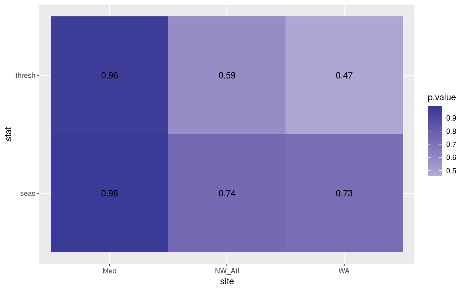
Heatmap showing the t-test results for the comparisons of the clim values for complete time series vs. those with ice coverage.
Expand here to see past versions of ice-ttest-p-1.png:
| Version | Author | Date |
|---|---|---|
| fa7fd57 | robwschlegel | 2019-03-19 |
From the heatmap above we see that there is no difference in the climatologies calculated when there is ice coverage.
Kolmogorov-Smirnov
clim_KS_p_ice <- function(df){
  df_na <- df %>%
    na.omit()
  df_comp <- sst_ALL_miss_clim_only_0 %>%
    filter(site == df$site[1],
           doy %in% df_na$doy)
  res <- data.frame(site = df$site[1],
                    seas = ks.test(df$seas, df_comp$seas)$p.value,
                    thresh = ks.test(df$thresh, df_comp$thresh)$p.value)
  return(res)
}

# The KS results
sst_ALL_ice_clim_KS_p <- sst_ALL_ice_clim_only %>%
  mutate(site_i = site) %>%
  group_by(site_i) %>%
  nest() %>%
  mutate(res = map(data, clim_KS_p_ice)) %>%
  select(-data) %>%
  unnest() %>%
  select(site, seas:thresh) %>%
  gather(key = stat, value = p.value, -site)

# visualise
ggplot(sst_ALL_ice_clim_KS_p, aes(x = site, y = stat)) +
  geom_tile(aes(fill = p.value)) +
  geom_text(aes(label = round(p.value, 2))) +
  scale_fill_gradient2(midpoint = 0.1)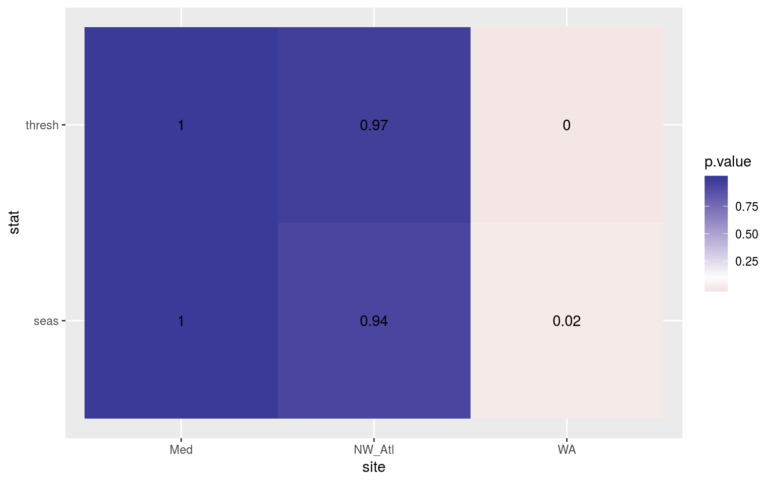
Heatmap showing the Kolmogorov-Smirnov p-values from comparing the climatology distributions for complete against ice coverage time series.
Expand here to see past versions of ice-KS-clims-1.png:
| Version | Author | Date |
|---|---|---|
| fa7fd57 | robwschlegel | 2019-03-19 |
Here we see that the overall shape of the climatologies for the WA time series do differ significantly when ice coverage is present. It should be pointed out that ann earlier version of this analysis used time series with the original decadal trends left in (rather than using the de-trended time series here) and no significant differences were found.
MHW metrics
I’m a little bit surprised at the results from the statistical climatology comparisons, but it makes sense if one thinks about it. Because the algorithm is not attempting to interpolate or otherwise fill any gaps, it does not actually change the data used for the climatology calculations. The result being that for the doy’s when climatologies are calculated, the results are the same as though there were no ice coverage at all.
The impact this may have on the MHWs (for the periods of the year where data are present) is something I am very much interested in seeing. I’m really not sure what the effect may be…
t-test
# # Calculate events
# suppressWarnings(
# sst_ALL_ice_event <- sst_ALL_ice_clim %>%
#   group_by(site) %>%
#   nest() %>%
#   mutate(res = map(data, detect_event)) %>%
#   select(-data) %>%
#   unnest()
# ) # Must supress warnings caused by big gaps or the machine crashes
#
# # Function for calculating t-tests on specific event metrics
# event_ttest_p_ice <- function(df){
#     df_comp <- sst_ALL_miss_event %>%
#       filter(site == df$site[1], miss == "0", rep == "1") %>%
#       mutate(month = month(date_peak, label = T))
#     if (df_comp$site[1] == "WA"){
#       df_comp <- df_comp %>%
#         filter(!(month %in% c("Jul", "Aug", "Sep")))
#     } else {
#       df_comp <- df_comp %>%
#         filter(!(month %in% c("Jan", "Feb", "Mar")))
#     }
#     res <- data.frame(site = df$site[1],
#                       duration = t.test(df$duration, df_comp$duration)$p.value,
#                       intensity_mean = t.test(df$intensity_mean, df_comp$intensity_mean)$p.value,
#                       intensity_max = t.test(df$intensity_max, df_comp$intensity_max)$p.value,
#                       intensity_cumulative = t.test(df$intensity_cumulative,
#                                                     df_comp$intensity_cumulative)$p.value)
#   return(res)
# }
#
# # The t-test results
# sst_ALL_ice_event_ttest_p <- sst_ALL_ice_event %>%
#   mutate(site_i = site) %>%
#   nest(-site_i) %>%
#   mutate(res = map(data, event_ttest_p_ice)) %>%
#   select(-data) %>%
#   unnest() %>%
#   select(site:intensity_cumulative) %>%
#   gather(key = stat, value = p.value, -site)
#
# # visualise
# ggplot(sst_ALL_ice_event_ttest_p, aes(x = site, y = stat)) +
#   geom_tile(aes(fill = p.value)) +
#   geom_text(aes(label = round(p.value, 2))) +
#   scale_fill_gradient2(midpoint = 0.1, limits = c(0, 1)) +
#   theme(axis.text.y = element_text(angle = 90, hjust = 0.5))
The heatmap above shows how similar (p-values from t-tests) the MHW metrics are for events detected in complete vs. ice coverage time series. In order to allow the comparison to be more accurate, I removed MHWs from the complete time series whose peak intensity dates occurred during the ice coverage months. Were one to leave these events in, the p-values do decrease, with the max and mean intensities for events in the Mediterranean becoming significantly different from one another.
I don’t think it is correct to compare the full events though, which is why I’ve rather chosen to remove events that occurred during ice coverage before comparing the results.
I think these results show rather conclusively that long blocks of continuous missing data in a time series (e.g. ice coverage) do not have an appreciable effect on the results of the climatologies or the resultant events detected. Of course, ice coverage will never be such a clean break. Rather, the random day or two of available data will encroach around the edges of the missing data, causing the MHW algorithm to need to interpolate across these smaller windows. That is an issue we will tackle in the section on missing n consecutive days, should we choose to go that in depth.
Missing weekends
sst_ALL_2_day <- sst_ALL_detrend %>%
  mutate(weekday = weekdays(t),
         temp = ifelse(weekday %in% c("Saturday", "Sunday"), NA, temp)) %>%
  select(-weekday)

# visualise
ggplot(sst_ALL_2_day, aes(x = t, y = temp)) +
  geom_line(data = sst_ALL_detrend, alpha = 0.2) +
  geom_line(aes(colour = site)) +
  facet_wrap(~site, scales = "free_y", ncol = 1) +
  labs(x = "", y = "temp. (C)")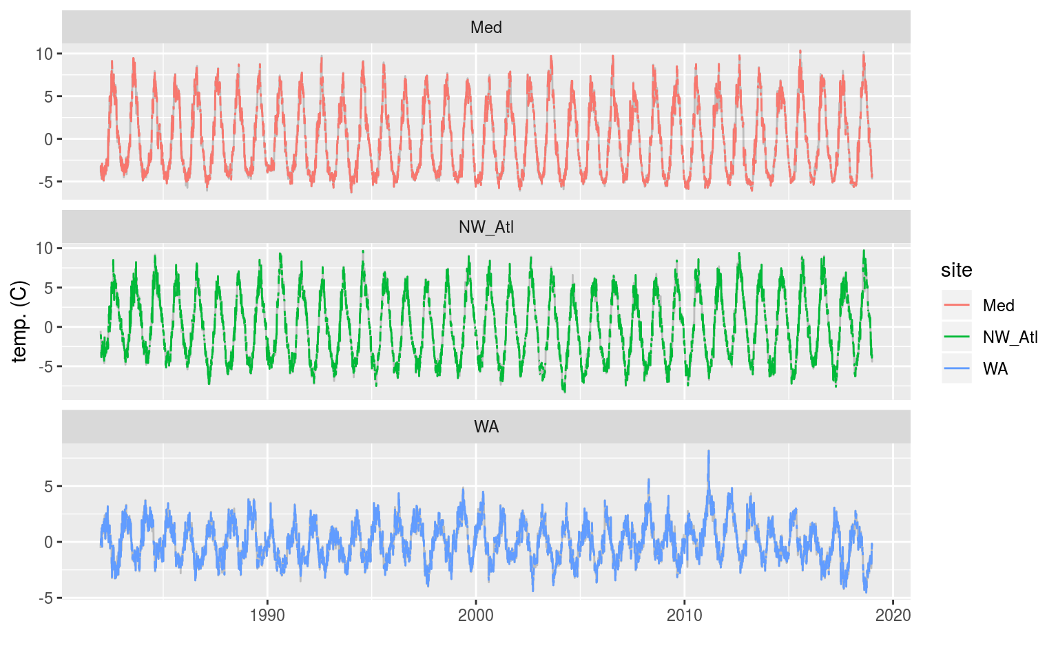
The three time series when weekend days have been removed. The complete time series is shown behind as a faint grey line.
Expand here to see past versions of 2-day-line-1.png:
| Version | Author | Date |
|---|---|---|
| fa7fd57 | robwschlegel | 2019-03-19 |
# Calculate the thresholds for all of the created time series
sst_ALL_2_day_clim <- sst_ALL_2_day %>%
  group_by(site) %>%
  nest() %>%
  mutate(clim = map(data, ts2clm, climatologyPeriod = c("1982-01-01", "2014-12-31"))) %>%
  select(-data) %>%
  unnest()

# Pull out the clims only
sst_ALL_2_day_clim_only <- sst_ALL_2_day_clim %>%
  select(-t, -temp) %>%
  unique() %>%
  arrange(site, doy)
Climatology statistics
I’ll not visualise the calculated climatologies here against the control as I don’t expect them to appear much different. Rather I’ll jump straight into the statistical comparisons.
t-test p-values
Because we are only comparing the distribution of two sample sets of data (no missing data vs. missing weekends), we will rather use a t-test to make the comparisons.
clim_ttest_p <- function(df){
  df_comp <- sst_ALL_miss_clim_only_0 %>%
    filter(site == df$site[1])
  res <- data.frame(site = df$site[1],
                    seas = t.test(df$seas, df_comp$seas)$p.value,
                    thresh = t.test(df$thresh, df_comp$thresh)$p.value)
  return(res)
}

# The t-test results
sst_ALL_2_day_clim_ttest_p <- sst_ALL_2_day_clim_only %>%
  mutate(site_i = site) %>%
  group_by(site_i) %>%
  nest() %>%
  mutate(res = map(data, clim_ttest_p)) %>%
  select(-data) %>%
  unnest() %>%
  select(site, seas:thresh) %>%
  gather(key = stat, value = p.value, -site)

# visualise
ggplot(sst_ALL_2_day_clim_ttest_p, aes(x = site, y = stat)) +
  geom_tile(aes(fill = p.value)) +
  geom_text(aes(label = round(p.value, 2))) +
  scale_fill_gradient2(midpoint = 0.1)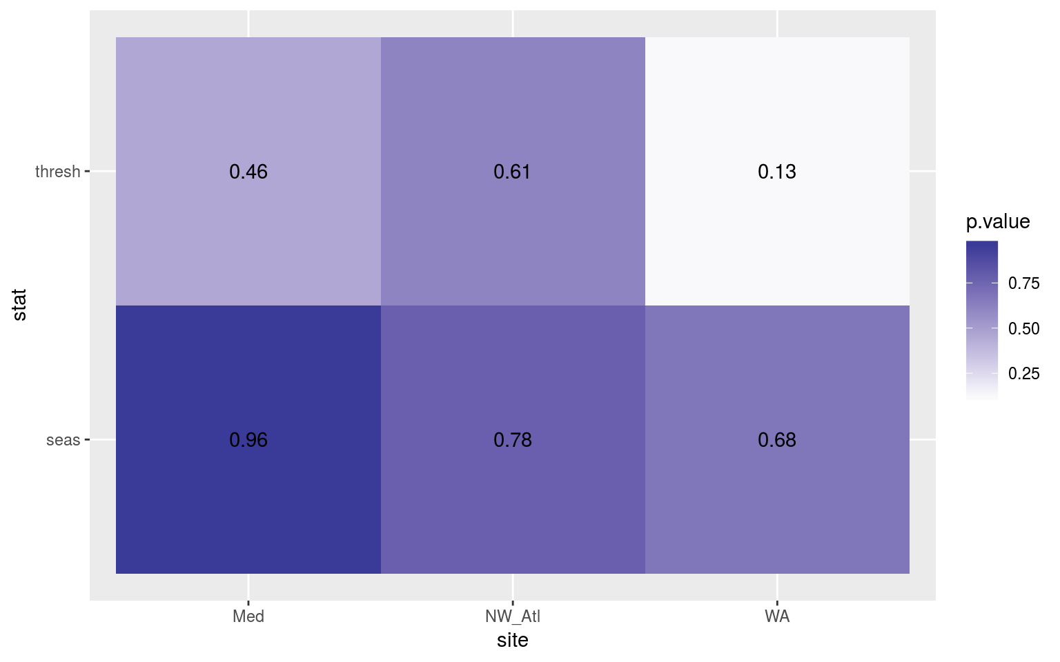
Heatmap showing the t-test results for the comparisons of the clim values for complete time series vs. those missing weekend days.
Expand here to see past versions of 2-day-ttest-p-1.png:
| Version | Author | Date |
|---|---|---|
| fa7fd57 | robwschlegel | 2019-03-19 |
The seasonal signals and 90th percentile thresholds do not differ appreciably.
As I’ve run a t-test here and not an ANOVA, I am not going to manually generate CI’s. Also, there are only two time series being compared here so CI’s aren’t as meaningful.
Kolmogorov-Smirnov
clim_KS_p <- function(df){
  df_comp <- sst_ALL_miss_clim_only_0 %>%
    filter(site == df$site[1])
  res <- data.frame(site = df$site[1],
                    seas = round(ks.test(df$seas, df_comp$seas)$p.value, 4),
                    thresh = round(ks.test(df$thresh, df_comp$thresh)$p.value, 4))
  return(res)
}
# The KS results
sst_ALL_2_day_clim_KS_p <- sst_ALL_2_day_clim_only %>%
  mutate(site_i = site) %>%
  group_by(site_i) %>%
  nest() %>%
  mutate(res = map(data, clim_KS_p)) %>%
  select(-data) %>%
  unnest() %>%
  select(site, seas:thresh) %>%
  gather(key = stat, value = p.value, -site)

# visualise
ggplot(sst_ALL_2_day_clim_KS_p, aes(x = site, y = stat)) +
  geom_tile(aes(fill = p.value)) +
  geom_text(aes(label = round(p.value, 2))) +
  scale_fill_gradient2(midpoint = 0.1)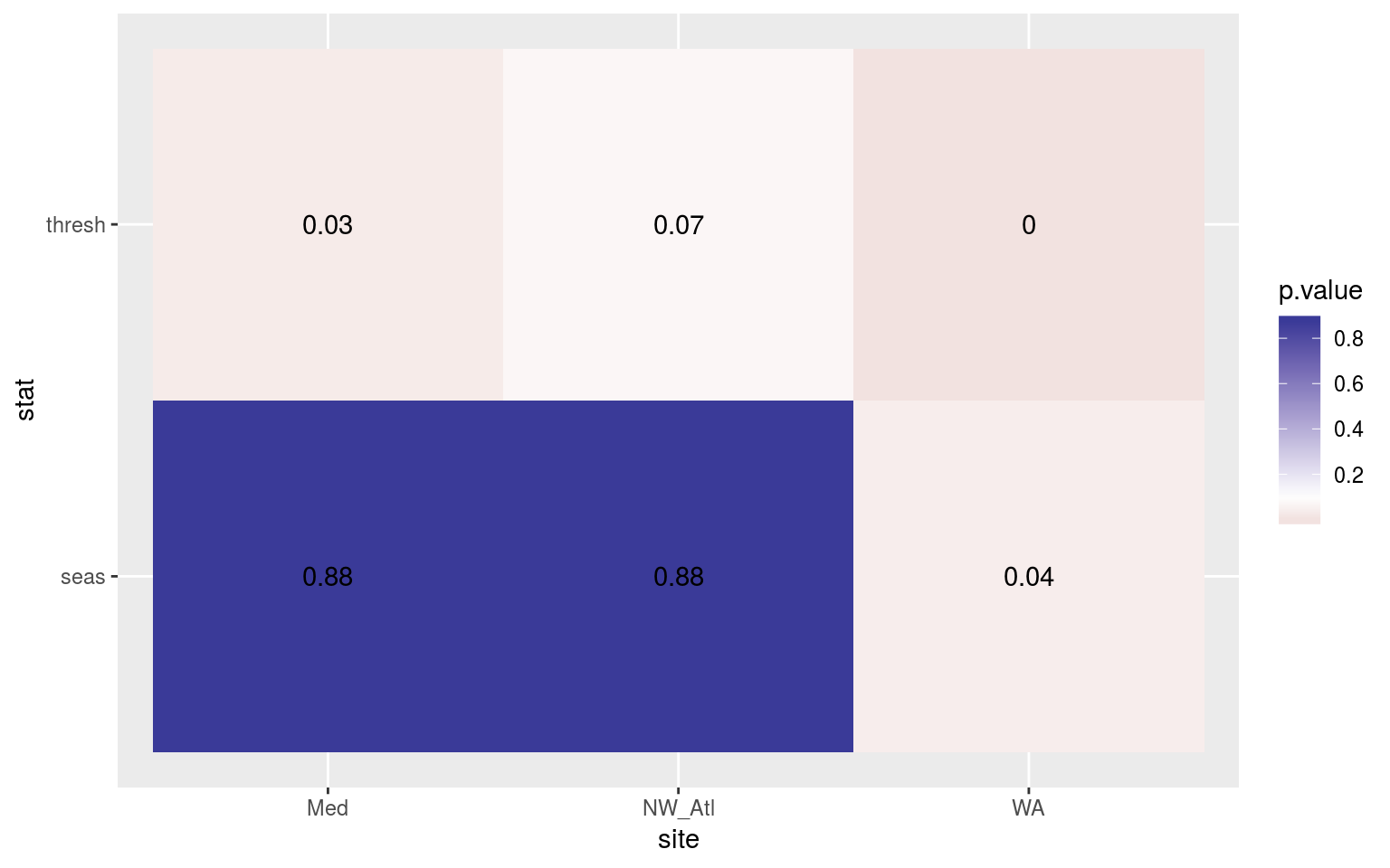
Heatmap showing the Kolmogorov-Smirnov p-values from comparing the climatology distributions for complete against missing weekend time series.
Expand here to see past versions of 2-day-KS-clims-1.png:
| Version | Author | Date |
|---|---|---|
| fa7fd57 | robwschlegel | 2019-03-19 |
Jip, differences.
MHW metrics
t-test
# # Calculate events
# sst_ALL_2_day_event <- sst_ALL_2_day_clim %>%
#   group_by(site) %>%
#   nest() %>%
#   mutate(res = map(data, detect_event)) %>%
#   select(-data) %>%
#   unnest()
#
# # Function for calculating t-tests on specific event metrics
# event_ttest_p <- function(df){
#     df_comp <- sst_ALL_event %>%
#       filter(site == df$site[1], miss == "0", rep == "1")
#     res <- data.frame(site = df$site[1],
#                       duration = t.test(df$duration, df_comp$duration)$p.value,
#                       intensity_mean = t.test(df$intensity_mean, df_comp$intensity_mean)$p.value,
#                       intensity_max = t.test(df$intensity_max, df_comp$intensity_max)$p.value,
#                       intensity_cumulative = t.test(df$intensity_cumulative,
#                                                     df_comp$intensity_cumulative)$p.value)
#   return(res)
# }
#
# # The t-test results
# sst_ALL_2_day_event_ttest_p <- sst_ALL_2_day_event %>%
#   mutate(site_i = site) %>%
#   nest(-site_i) %>%
#   mutate(res = map(data, event_ttest_p)) %>%
#   select(-data) %>%
#   unnest() %>%
#   select(site:intensity_cumulative) %>%
#   gather(key = stat, value = p.value, -site)
#
# # visualise
# ggplot(sst_ALL_2_day_event_ttest_p, aes(x = site, y = stat)) +
#   geom_tile(aes(fill = p.value)) +
#   geom_text(aes(label = round(p.value, 2))) +
#   scale_fill_gradient2(midpoint = 0.1, limits = c(0, 1)) +
#   theme(axis.text.y = element_text(angle = 90, hjust = 0.5))
The figure above shows the results of t-tests for each metric between the complete time series and when the weekend temperature data have been removed. There is no appreciable impact on the detected duration/intensities.
Best practices
(RWS: I envision this last section distilling everything learned above into a nice bullet list. These bulleted items for each different vignette would then all be added up in one central best practices vignette that would be ported over into the final write-up in the discussion/best-practices section of the paper. Ideally these best-practices could also be incorporated into the R/python distributions of the MHW detection code to allow users to make use of the findings from the paper in their own work.)
Options for addressing many missing random data
- Ideally we could come up with a recommended correction to the threshold given a proportion of missing data. i.e. The threshold is reduced when more data are missing. So what is this ratio and how do we work it in.
Options for addressing many missing non-random data
- Interpolating
- Basically a section should be worked out here that covers how much one can interpolate before things go sideways.
Session information
sessionInfo()R version 3.5.3 (2019-03-11)
Platform: x86_64-pc-linux-gnu (64-bit)
Running under: Ubuntu 16.04.5 LTS
Matrix products: default
BLAS: /usr/lib/openblas-base/libblas.so.3
LAPACK: /usr/lib/libopenblasp-r0.2.18.so
locale:
[1] LC_CTYPE=en_CA.UTF-8 LC_NUMERIC=C
[3] LC_TIME=en_CA.UTF-8 LC_COLLATE=en_CA.UTF-8
[5] LC_MONETARY=en_CA.UTF-8 LC_MESSAGES=en_CA.UTF-8
[7] LC_PAPER=en_CA.UTF-8 LC_NAME=C
[9] LC_ADDRESS=C LC_TELEPHONE=C
[11] LC_MEASUREMENT=en_CA.UTF-8 LC_IDENTIFICATION=C
attached base packages:
[1] stats graphics grDevices utils datasets methods base
other attached packages:
[1] bindrcpp_0.2.2 ggridges_0.5.0 mgcv_1.8-24
[4] nlme_3.1-137 FNN_1.1.2.1 boot_1.3-20
[7] ggpubr_0.1.8 magrittr_1.5 fasttime_1.0-2
[10] lubridate_1.7.4 heatwaveR_0.3.6.9003 data.table_1.11.6
[13] broom_0.5.0 forcats_0.3.0 stringr_1.3.1
[16] dplyr_0.7.6 purrr_0.2.5 readr_1.1.1
[19] tidyr_0.8.1 tibble_1.4.2 ggplot2_3.0.0
[22] tidyverse_1.2.1
loaded via a namespace (and not attached):
[1] Rcpp_0.12.18 lattice_0.20-35 assertthat_0.2.0
[4] rprojroot_1.3-2 digest_0.6.16 R6_2.2.2
[7] cellranger_1.1.0 plyr_1.8.4 backports_1.1.2
[10] evaluate_0.11 httr_1.3.1 highr_0.7
[13] pillar_1.3.0 rlang_0.2.2 lazyeval_0.2.1
[16] readxl_1.1.0 rstudioapi_0.7 whisker_0.3-2
[19] R.utils_2.7.0 R.oo_1.22.0 Matrix_1.2-14
[22] rmarkdown_1.10 labeling_0.3 htmlwidgets_1.2
[25] munsell_0.5.0 compiler_3.5.3 modelr_0.1.2
[28] pkgconfig_2.0.2 htmltools_0.3.6 tidyselect_0.2.4
[31] workflowr_1.1.1 RcppRoll_0.3.0 viridisLite_0.3.0
[34] crayon_1.3.4 withr_2.1.2 R.methodsS3_1.7.1
[37] grid_3.5.3 jsonlite_1.5 gtable_0.2.0
[40] git2r_0.23.0 scales_1.0.0 cli_1.0.0
[43] stringi_1.2.4 reshape2_1.4.3 xml2_1.2.0
[46] tools_3.5.3 glue_1.3.0 hms_0.4.2
[49] yaml_2.2.0 colorspace_1.3-2 rvest_0.3.2
[52] plotly_4.8.0 knitr_1.20 bindr_0.1.1
[55] haven_1.1.2 This reproducible R Markdown analysis was created with workflowr 1.1.1