EDAV: Exploring the Yelp Dataset
Sam Guleff, Justin Law, Tony Paek, Jordan Rosenblum, Steven Royce
Discovery of Similar Restaurants
All of us have favorite restaurants. Natural information of interest is to identify similar restaurants to those favorite restaurants so that users expand their selection of restaurants to their liking. Several methods can be deployed to identify similar restaurants.
1. Feature-Based Recommendation
The most natural way to identify restaurants is based on the features of restaurants, the critical ones of which include features such as distance, types of a restaurant (i.e. cuisine), price range, etc. The first conceptualization of this recommendation engine conjectured a graph representation of restaurants, with the degree of similarity (or distance) represented by the size of edges.
The conjectured recommendation engine based on the selection of a particular restaurant would look like a star graph above, with the customization features allowing users to weight each feature differently so that the length of edges would vary and the closer restaurants based on the updated features would be displayed.
However, one big skepticism was to what extent users would appreciate the level of customization to this recommendation engine. How would we also deal with categorical variables? For example, if a chosen restaurant is a Chinese restaurant, should the similar restaurants be filtered so that only Chinese restaurants are compared, or penalize the restaurants by adding more distance. If we’re penalizing it, to what extent would we penalize it?
Similarly, the most intuitive way to initialize the weight of each variable is unclear. While most users would acknowledge that price, restaurant types and distance may be important factors, other features become fuzzy.
Lastly, data were sparse, meaning that a significant proportion of restaurants did not have features of interest. In short, there did not seem to be a rigorous way, without a very subjective initialization of the weights of each feature, to make similar restaurants show up. Therefore, we decided not to pursue this method.
2. User-Based Recommendation
An alternative way to identify similar restaurants is based on user behavior. Yelp has an extensive record of user reviews and check-in data for each restaurant. By looking at the user behaviors of restaurant visits, the similar restaurants can be identified, based on the assumption that users would like to go to similar restaurants. There are several strengths to this technique. The first advantage is that by identifying user behaviors, we’re capturing restaurants that share similar customers that may not share similar features. New restaurants can be explored more in a way that other users explore restaurants.
Secondly, it is rigorous. No subjective measure has to be inputted in performing collaborative filtering, barring specific techniques, and the results are intuitive as well. Mainly, two techniques are explored.
1) Collaborative Filtering - Jaccard Index
A Jaccard index is calculated by calculating the intersection divided by the join.
In the context of restaurants, this essentially translates into the proportion of customers two restaurants share over the total number of customers. As I did not see the negative reviews to be a sign of a user’s taste, only reviews of 4 or higher are counted, and also, users with check-ins are counted as well to be a customer of a restaurant. Thereafter, the highest 30 similar restaurants were ranked.
2) Matrix Factorization
An alternative to the Jaccard Index is matrix factorization. While collaborative filtering is simple and intuitive, matrix factorization has an advantage in that it incorporates the latent features behind the interactions between the restaurants and users. While the detailed techniques are not discussed here, it essentially utilizes the ratings of each restaurant in order to calculate distances between restaurants and rank similar restaurants accordingly. The results herein are utilized to identify similar restaurants and plot them accordingly in a Leaftlet map which is embedded in a Shiny app.
Interactive Plotting
Cleaning the data and interactive plotting in Leaflet and Shiny
A large portion of the time invested was spent merging and cleaning multiple data sources such as price data for each restaurant (since our dataset did not include price, we had to scrape for it), matrix factorization similarity scores, and other business attributes. We started off visualizing the data in the R package ggmap but wanted a more interactive experience so switched to Shiny and Leaflet.
We use a dataset of restaurants in the vicinity of Columbia University obtained from Yelp (as of 2012). The various restaurants are rendered in Leaflet and embedded within Shiny for interactive plotting. As an initialization point, all restaurants are weighted equally and plotted on the map. Thereafter, the central restaurant chosen by the user, through the search feature embedded within Shiny, is plotted as the Yelp logo. We enabled a feature such that the clicking of a bubble that represents each restaurant would show additional information, including the name, price, location and its link to the actual Yelp page.
Given the central restaurant represented as a Yelp logo marker, the top 10 similar restaurants are plotted with the size of the markers corresponding to the similarity. As we wanted the ‘close’ restaurants to be displayed in a bigger marker, we subtracted the rank from a fixed number, so that the size of the markers is in a descending order with respect to how similar a particular restaurant is to the central restaurant. In order to display the hyperlinks that lead to the actual Yelp page of a restaurant and display images, HTML code was manually embedded within Shiny.
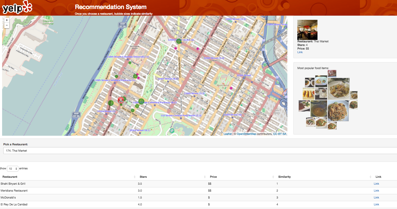
Several technical difficulties existed in utilizing a Leaflet Package with Shiny. First, we tried using the R packaged called leafletR but found that it was not flexible enough and did not support integration with Shiny. Therefore, we switched to using the packaged called leaflet which does have integrability with Shiny. The second major issue we had was that as a user selects a particular restaurant, the server takes as an input a string. However, the name of a restaurant may not be unique. To avoid the redundant names, an index was used. From the perspective of a user, a user sees a number (index) plus a restaurant name, and the string was split so that the index was used to access unique restaurants.
The biggest limitation in utilizing a Leaflet package or any other interactive map plotting packages in R for that matter was the inability to extract information from users navigating the map. Ideally, we would have wanted auxiliary information, such as the table of restaurants, price information and star maps, to respond to what is shown in the map in the current zoom. However, the R package did not support the communication of how users zoom-in or zoom-out of a map and performing reactive programming so that the auxiliary information responds to it. A further exploration of this would be through customized Javascript so that other other information responds to how users navigate through the map as well.
We then integrated our D3 FoodMap (described more below) within our Shiny app so that given a central restaurant, users can see what dishes are most popular there.
2D User Preference Search
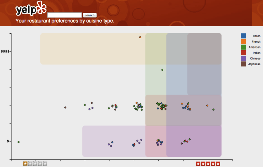
Typical search functionality only displays results in a one-dimensional list. A user then sorts and filters on other attributes however this limits the usefulness of these other attributes. To better visualize these results we constructed a two-dimensional representation of Yelp results based on the primary restaurant selection attributes, cost and overall rating. By displaying the restaurant results in a scatterplot users can quickly weigh cost versus ratings more affectively.
While developing this visualization, we realized that cost and rating preferences also vary by cuisine type. For example, some users may be price conscious with regard to Chinese, rating conscious for Japanese, and price agnostic for American cuisine. We decided to represent these preferences as color-coded boundaries in the scatter plot. The current demo shows preferences based on a sample user, however in production this would be a model that is learned from each user’s Yelp reviews and check-ins in relation to the existing restaurant data.
The image below shows the demo users top six cuisine preferences and a sample set of restaurants in close proximity. From this view we can quickly see less preferred restaurants. After a quick scan the user could search by any cuisine, or hover over and pick any restaurant, to see all relevant restaurant details below the plot.
The image below shows the results after a search for American cuisine, where it becomes quickly apparent that there is only a subset of restaurants that would be desirable based on price and ratings preferences. Now the user can determine the best trade-off between cost and price within this subset, and select their top choice.
Future improvements
The logical next step would be to develop a predictive model with inputs from user ratings, check-in, and restaurant review data which determines restaurant preference boundaries and top cuisine choices. With this model the boundaries would now be generated dynamically and updated automatically as more restaurants are reviewed.
To make this a viable product for Yelp we would need to consider adding sponsored restaurant results within the user preference boundaries that are topmost or slightly highlighted and larger. This would be analogous to results at the top of a search results page.
Additionally, we actually have the ability to display a third dimension through the use of point size. This could be used to represent anything from trending popularity to relative distance.
Conclusion
We believe that the visualization provides additional value to a Yelp user, enabling them to make faster and more informed decisions. Additionally, they will enjoy seeing search results and cuisine type preferences visually.
Food Map
Yelp at its core recommends businesses to its users and this is no different when users search for the best places to get food. One could argue that when users are looking for food, what they are truly concerned about is what the best food items are and restaurants that serve them are more of a peripheral concern. Personally, I find the Yelp experience not to be the most streamlined as I often still have to read multiple reviews in order to determine which dish the restaurant serves is the best to order. An anecdote to this experience can be said to be the digital vs. physical content divide. While some users may care about the look and feel of a physical book, plenty of users would be sufficient with just getting straight to the content within the books through a digital delivery system.
So the key idea here is that we would want to visualize the best dishes or food items to recommend rather than recommend users restaurants. Another benefit of doing this is that photos of food items are often much more meaningful and appealing to users compared to photos of restaurants so it is much easier to represent a single food item visually compared to a restaurant.
Following that, we would also like to rank these food items through visual means and not have users read through more reviews just to understand how well a food item ranks relative to others. A five star rating system also doesn’t work as well here because having too many food items of the same rating defeats the purpose of a ranking system. So the idea then follows that we would require a more continuous metric to rank the food items in order to better show relative differences between food items. However as the Yelp review system is not designed to focus on food items, we decided to simply use the number of reviews tagged to each food item and we believe that this is a good heuristic for relative popularity of items.
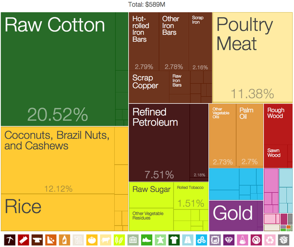
For a visualization method that can utilize photos and could rank these photos visually, a treemap naturally comes into mind. However, the traditional treemap cannot be utilized as is for this purpose as a treemap utilizes rectangles of many different ratios. Usually there is a defined width and height ratio range for viewing photos and making a photo either too wide or too tall would obscure what the photo is actually showing. Squares would then be the best choice as it is a typical practice to crop photos into squares. Another benefit of using squares instead of rectangles is that it is far easier to compare the relative sizes of two squares compared to two rectangles with different ratios. Two rectangles placed together side by side may look equal, but the other axis could still be slightly different and hard to distinguish without measuring it or being told the actual area of the rectangles.
This leads to the next question of why do treemaps use rectangles and not squares. It turns out that it is not possible to fit a defined amount of squares perfectly scaled into a defined rectangular canvas and this behavior is described in a research paper as well. One possible solution to this scenario that we thought of was to simply throw away squares starting from the smallest ones until everything fits nicely into the canvas. The other solution that we discovered and thought was a much more elegant solution was the spiral squares treemap used in the 2014 Presidential budget Washington Post article. While this method can have potential layout issues when displaying too many squares (>17), it does present an advantage where it is easier to discern where the largest squares are as they start from the center and spiral out.

As we are unaware of any existing visualization packages that produces this kind of spiral square treemap, we decided to build our own from ground up using d3. Generating the squares is not particularly difficult as we simply require the coordinates and edge lengths of each square, but calculating the coordinates is no simple task and requires designing an algorithm for it.
Algorithm
The algorithm was designed considering the following items:
- Input is an array of numbers (e.g., review counts of food items)
- Output is an array of coordinates and lengths for drawing squares in d3
- Efficient use of space by placing squares as close to the center as possible without overlapping
- Written in JavaScript for compatibility with d3
- Reusability for sharing with the d3 community
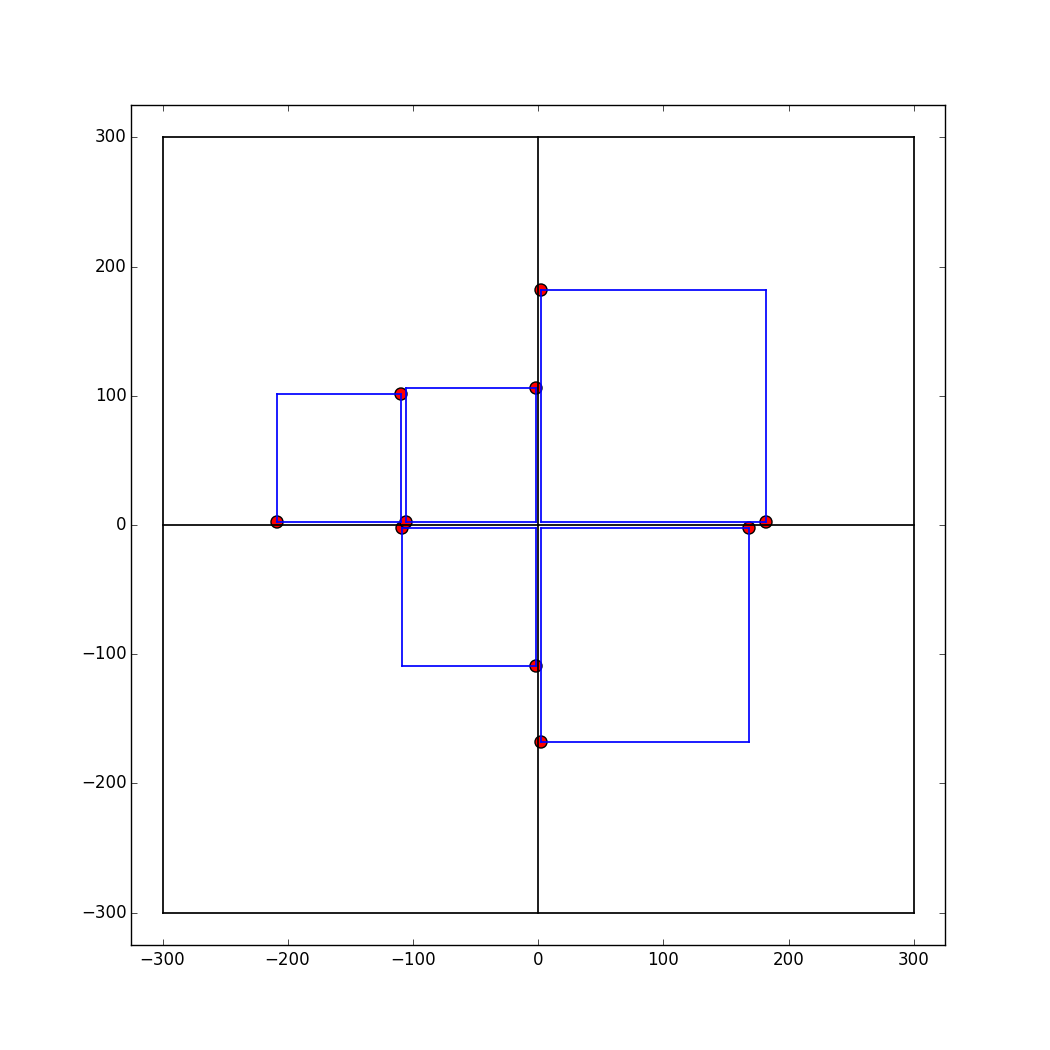
The process for placing squares was motivated by the methodology outlined here. The first step is to sort the input array in a descending order (largest to smallest). Then, the placement of the first four squares is fixed: take the first four values of the sorted array and compute the coordinates such that the corresponding squares will be placed in a clockwise fashion around the center (starting from the upper right quadrant). This step is fixed regardless of the input array. The figure below illustrates this process for a random input with four numbers.
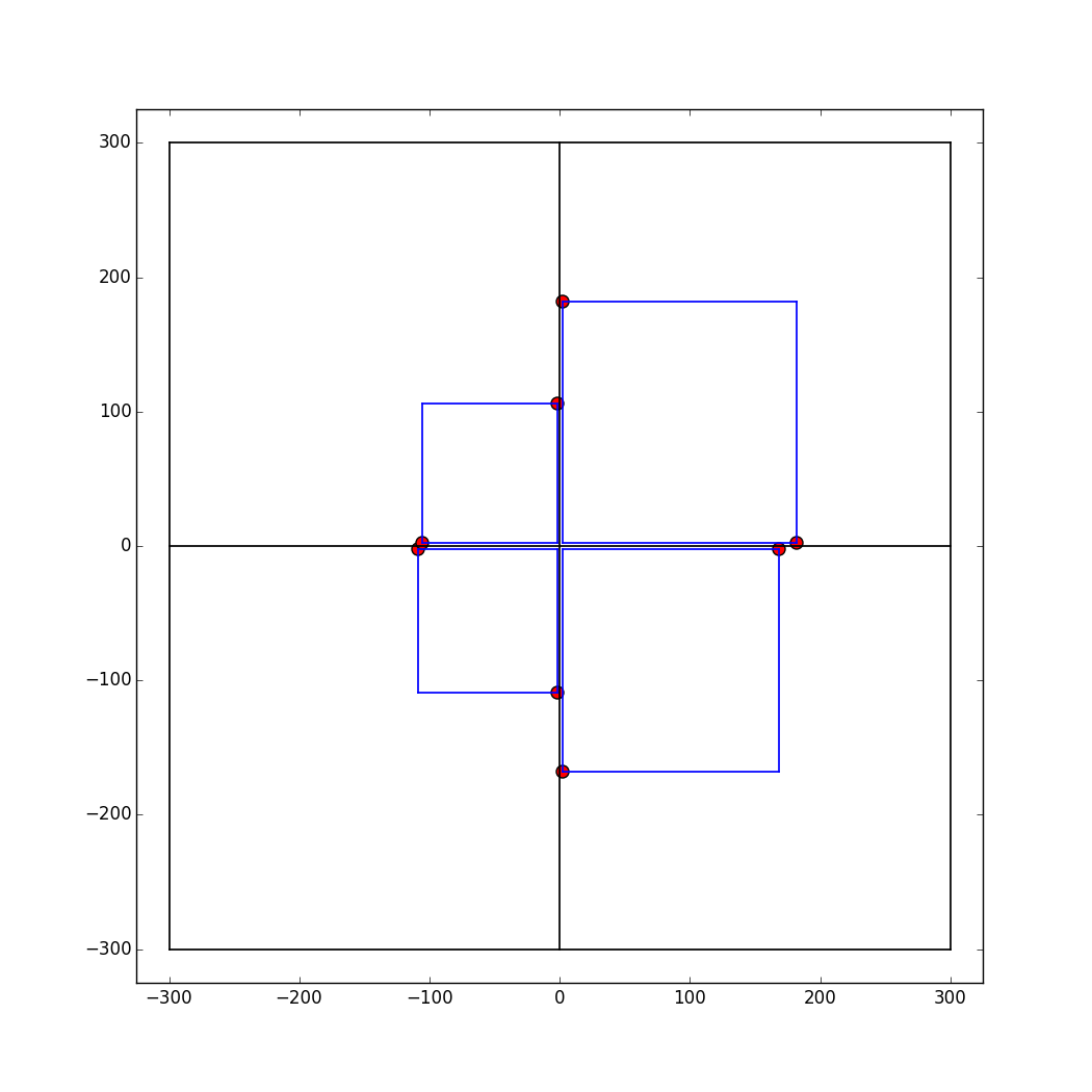
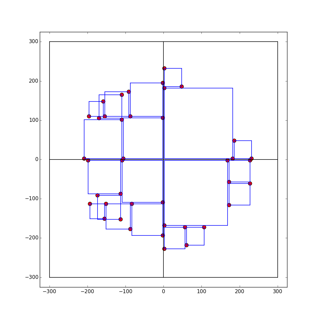
Subsequent squares are placed considering the allowable locations, which are shown as red points in the figure above. At each iteration, the algorithm searches for the point closest to the center and, using that point, computes the coordinate for placing the next square. Once a point is selected and used for placing a square, that point is removed from consideration from that iteration onwards. If there is a tie (2 or more allowable points equidistant from the center), the algorithm will return the first coordinate it finds that meets the criteria. Finally, if a new square is added, the allowable locations for the next iteration will increase by two. The figure below illustrates this process for a random input with five numbers.
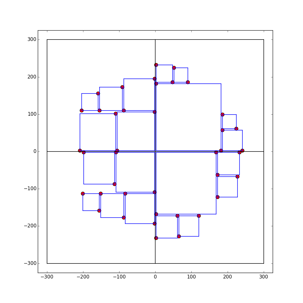
The methodology described up until this point was adapted from the article mentioned above. From this point onward, however, a different design choice was made than what is described in the article. The author of the article stated that "if a square juts out from both edges of the corner, [the algorithm] moves on to the next closest corner and tries again." Such restrictions are needed to prevent overlapping of squares as illustrated in the figure below.
We implemented a different mechanism for handling the overlapping problem. The rule is simple: check to see if adding a square would result in an overlap. If it does, then go to the next point closest to the center and check for the same. If it does not, then we can safely add the square at that location. The figure below illustrates the result of incorporating this rule to the algorithm. Implementing this rule increases the computational cost of the algorithm. Suppose the size of the input array is n, then a crude estimate of the running time is O(n2) (for each square we need to check whether it overlaps with any other square). Despite this, there is no noticeable lag when rendering the entire food map.
Final Products, Notes on the Data, Code, and Team Organization
Our final products can be found at the following links:
The data
Note: The Yelp datasets above are from 2012 so there are some restaurants in the dataset which have gone out of business.
Our code
Specialization areas
Sam Guleff: D3 2D User Preference Search, Integration
Justin Law: JavaScript, D3 FoodMap, Data Scraping, API, Integration
Tony Paek: Models/Matrix Factorization, Shiny
Jordan Rosenblum: Leaflet similarity map, Shiny, Integration
Steven Royce: Algorithm for placing FoodMap squares, JavaScript

